C A S E S T U D Y
P A G E U P D A T E
SOPHIA LEARNING
O V E R V I E W
O V E R V I E W
About the project
Sophia Learning is an online learning platform that offers over 80+ college-level credit courses. With a decade of experience, Sophia Learning provides affordable, self-paced courses accessible anytime and anywhere, catering to students at various stages of their educational journeys.
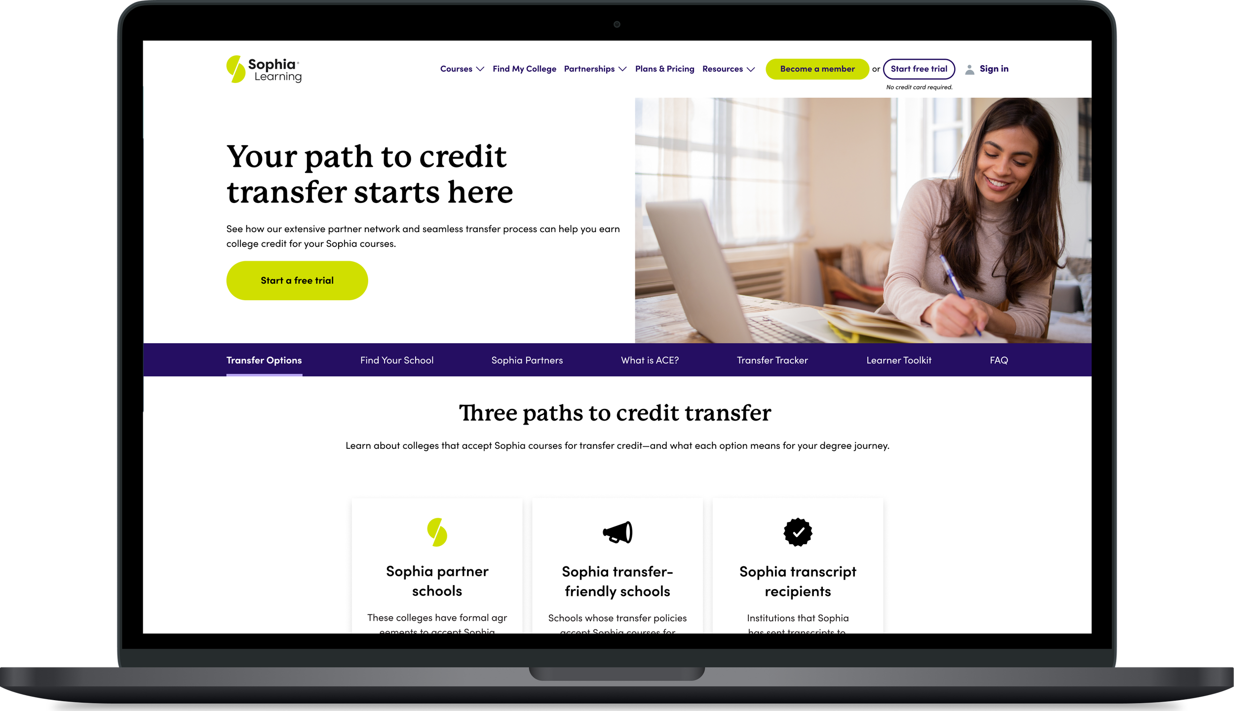
The Find Your School (FYS) page is a critical entry point in the Sophia.org transfer-credit journey, helping prospective learners understand whether and how Sophia courses may transfer to their institution. While the page provides access to partner school and transfer information, the current experience presents usability challenges and is not driving the desired level of user engagement or conversion.
Scroll prototype to to see page
O V E R V I E W
The challenge
To develop an effective solution for the Find Your School page refresh at Sophia Learning, I led a structured, multi-phase UX design process that balanced user needs with business objectives.
The project began with a discovery phase, where I collaborated with the Product Owner, Analytics team, and Marketing managers to gather insights, review performance metrics, and define the business goals for the new experience.
Next, I conducted a competitive analysis to evaluate similar experiences across the higher education and edtech industries. This research helped identify UX best practices, design patterns, and content strategies that could improve usability, engagement, and the overall transfer credit experience.
Using the insights gathered from discovery and competitive research, I created low-fidelity wireframes to explore potential solutions. I presented these concepts to executive stakeholders—including the CEO, CMO, and Marketing Directors—to gather feedback, validate the design direction, and ensure the proposed experience aligned with both user expectations and business goals.
The final phase involved creating responsive, high-fidelity mockups and collaborating closely with the development team throughout implementation. I worked closely with the Business analysts and Product Owner to annotate the designs for handoff. The project was delivered across multiple development sprints, and I partnered with a Web Author during the build process to ensure the final experience was implemented accurately and maintained design consistency from concept to launch.
O V E R V I E W
Design process
The existing experience had become outdated and no longer met the needs or expectations of today's users.
Several challenges were identified during the discovery phase.
Interface: The interface lacked a modern, intuitive experience, making it difficult for users to quickly find relevant information and understand their transfer options.
Content and layout: The content and navigation did not effectively guide users through Sophia's transfer process, resulting in confusion and missed opportunities to build confidence in the platform.
Conversion: From a business perspective, the page was also underperforming. Limited engagement with partner school information and a lack of personalized experiences contributed to lower-than-desired conversion rates for Sophia subscriptions.
User experience: Additionally, the experience did not fully support partnerships by showcasing transfer pathways in a meaningful and engaging way.
The challenge was to redesign the Find Your School experience to create a more user-friendly, informative, and engaging journey—one that clearly explains the transfer process, strengthens relationships with partner institutions, and ultimately increases user engagement and subscription conversions.

01
UX DESIGN LEAD
Role - Owned the end-to-end design process
02
SIX MONTHS
Duration - The project took a total of six months
03
PRODUCT
Team - Collaborated with cross-functional teams
O V E R V I E W
Tools used
Throughout this project, I leveraged a variety of tools to support collaboration, design, and user research. I used Asana to manage tasks and communicate with stakeholders and project managers, ensuring alignment throughout the project lifecycle. Figma served as the primary design tool for creating low-fidelity wireframes, high-fidelity mockups, and responsive prototypes.
I used FigJam when I conducted the competitive analysis. I collaborated with developers and business analysts in Jira to track development progress, manage implementation, and address design feedback during each sprint. To validate design decisions, I used Maze to conduct usability testing, including heat map and preference tests, allowing me to gather user insights and iterate on the experience before development.

T I M E L I N E
DISCOVERY
November - December
PROJECT KICKOFF
RESEARCH
DESIGN
January - February
UI DESIGN
DELIVERY
March - May
PAGE LAUNCH
DEVELOPER HANDOFF
R E S E A R C H
R E S E A R C H
Design inspiration
Once the kickoff phase was complete, I began exploring visual inspiration to establish a clear creative direction for the Find Your School page. I researched current design trends and digital experiences across platforms such as Pinterest, Behance, and Dribbble, focusing on layouts, visual patterns, interactions, and components that could inform the overall experience.
I collected relevant examples and documented my initial thoughts and observations in FigJam. From there, I collaborated with my Product Owner to brainstorm and conceptualize potential design directions. This exploration helped shape our initial ideas and provided a foundation for the next phase of research.
I then transitioned into a competitive analysis to further evaluate industry patterns, identify opportunities, and ensure the design direction was informed by both visual inspiration and user-centered research.
Competitor analysis
P R O S
Search feature with drop down list
Top schools sectioned off into a categories with descriptions
Components are sectioned off well and organized
C O N S
Copy is slightly redundant
Although the Partner schools are sectioned off the list and card views feel somewhat confusing experience
R E S E A R C H
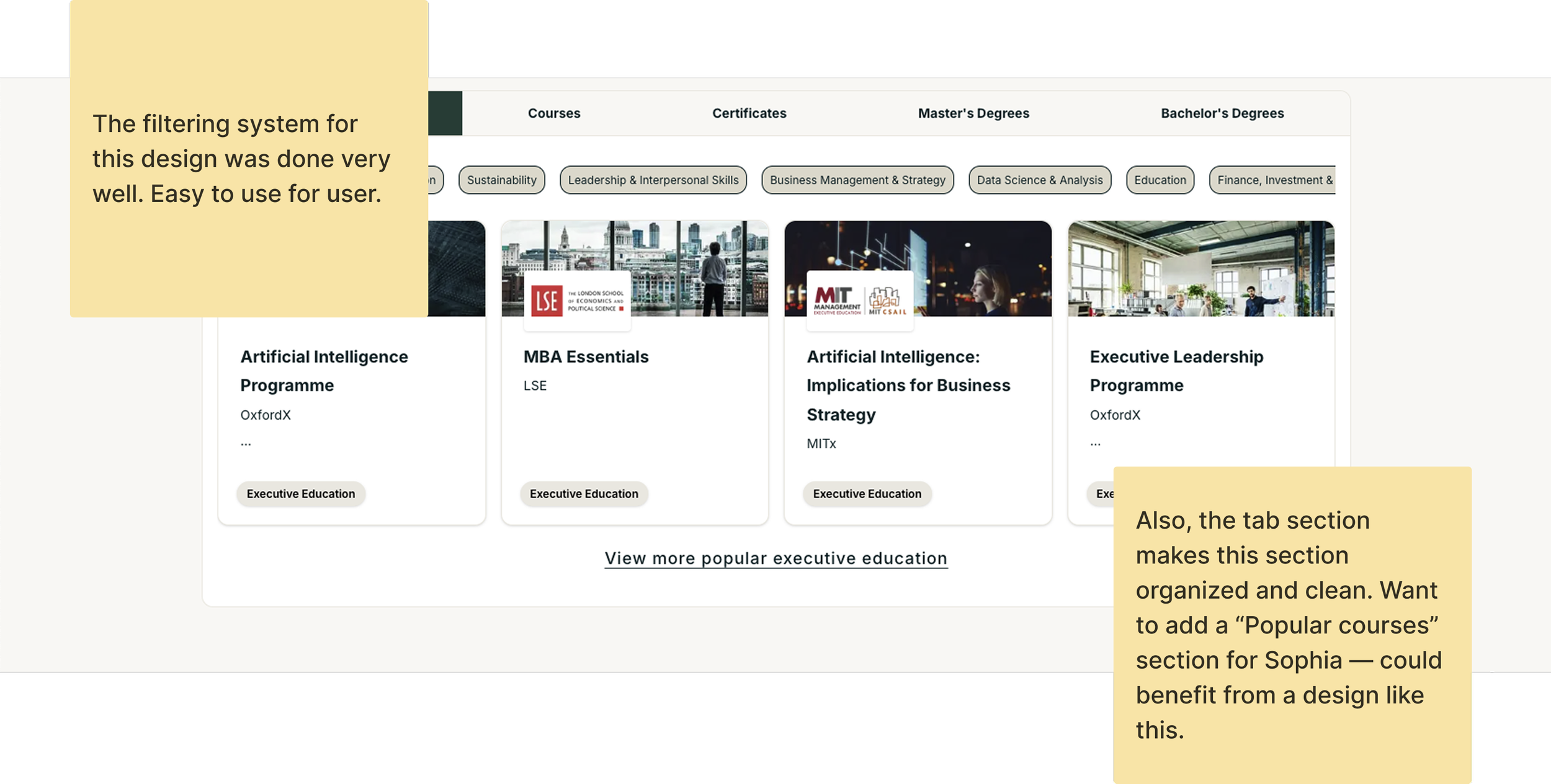
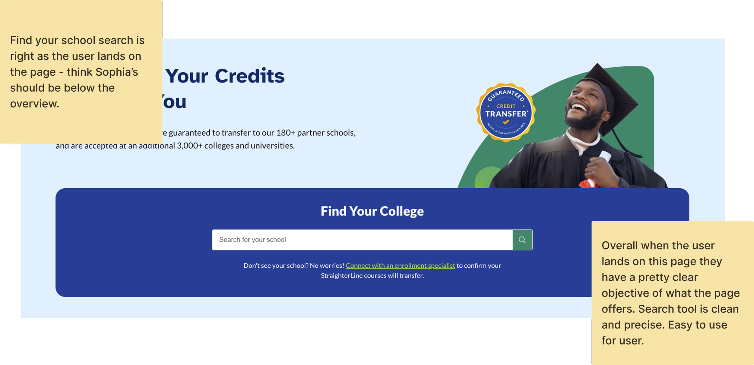
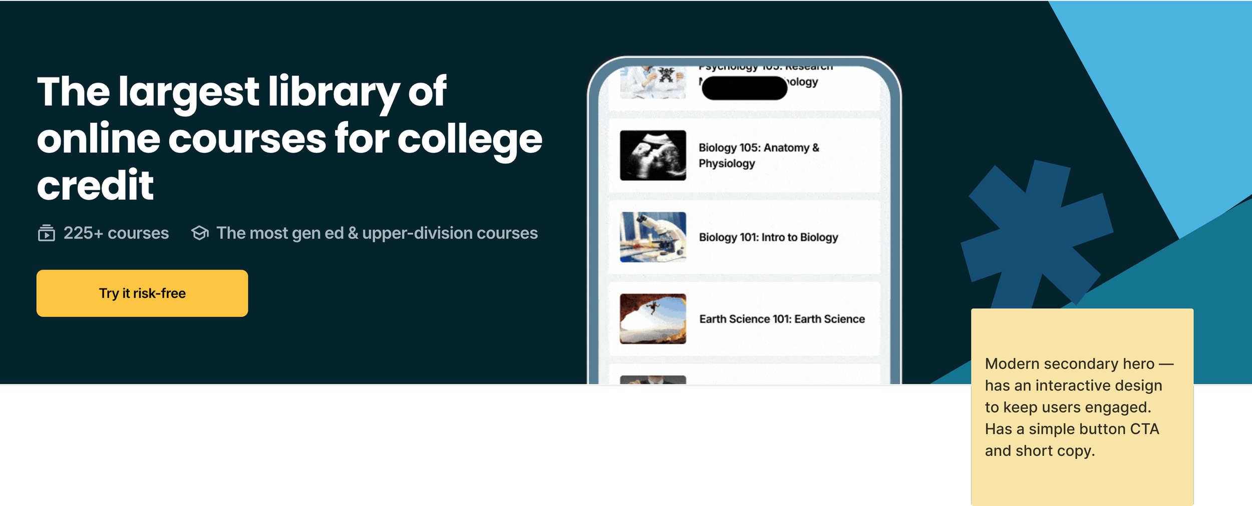
For the competitive analysis phase of the project, I evaluated the Find Your School experiences of three key competitors. I conducted a structured review of each experience, evaluating key areas including design, copy, content and layout, and user experience.
Using a sticky note framework, I documented the strengths, weaknesses, patterns, and opportunities identified across each competitor. I then synthesized these observations into actionable insights to help inform the design direction for the Find Your School page.
After completing the analysis, I presented my findings to the marketing team to gather additional perspectives, validate key observations, and ensure alignment with business and content goals. I incorporated their feedback into the next phase of the project and used the combined insights to guide the development of my low-fidelity wireframes.

P R O S
Popular courses section keeps the user engaged
Hero has a STAT’s design
Banner design below search to explain more about the transfer process
C O N S
Not that much copy on page
Partner grid is very long and the experience is not simple for user

P R O S
Popular courses section keeps the user engaged — in-depth filtering
Popular topics section to take users to other pages
Carousel hero
C O N S
Copy is somewhat confusing
Logo banner not automatic
Logo wall is a nice touch but too long
W I R E F R A M E S
W I R E F R A M E S
Ideation and sketches
After completing the competitor analysis, I began ideation sketches to shape the overall look and functionalityAfter completing the competitive analysis, I transitioned into the ideation phase to explore the overall structure and user experience for the refreshed Find Your School page. I began by sketching concepts to establish the page's information architecture, focusing on creating a clear, intuitive layout that would simplify the user journey and make key transfer information easy to find.
These early concepts allowed me to evaluate different component placements, content hierarchy, and interaction patterns before committing to a final direction. Building on the strongest ideas from the sketching phase, I translated the concepts into low-fidelity wireframes, creating a foundational design that could be reviewed with stakeholders and iterated on based on feedback.
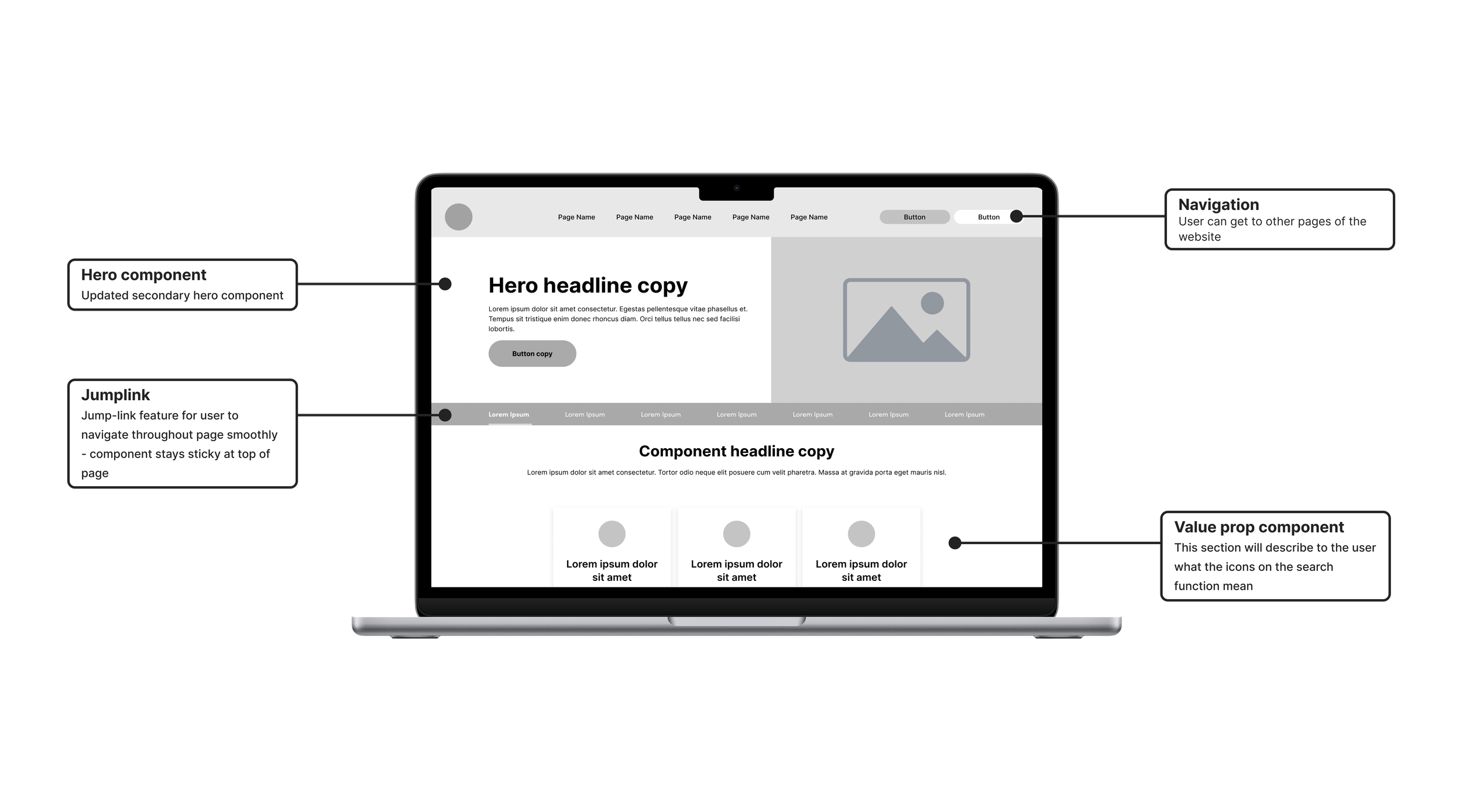
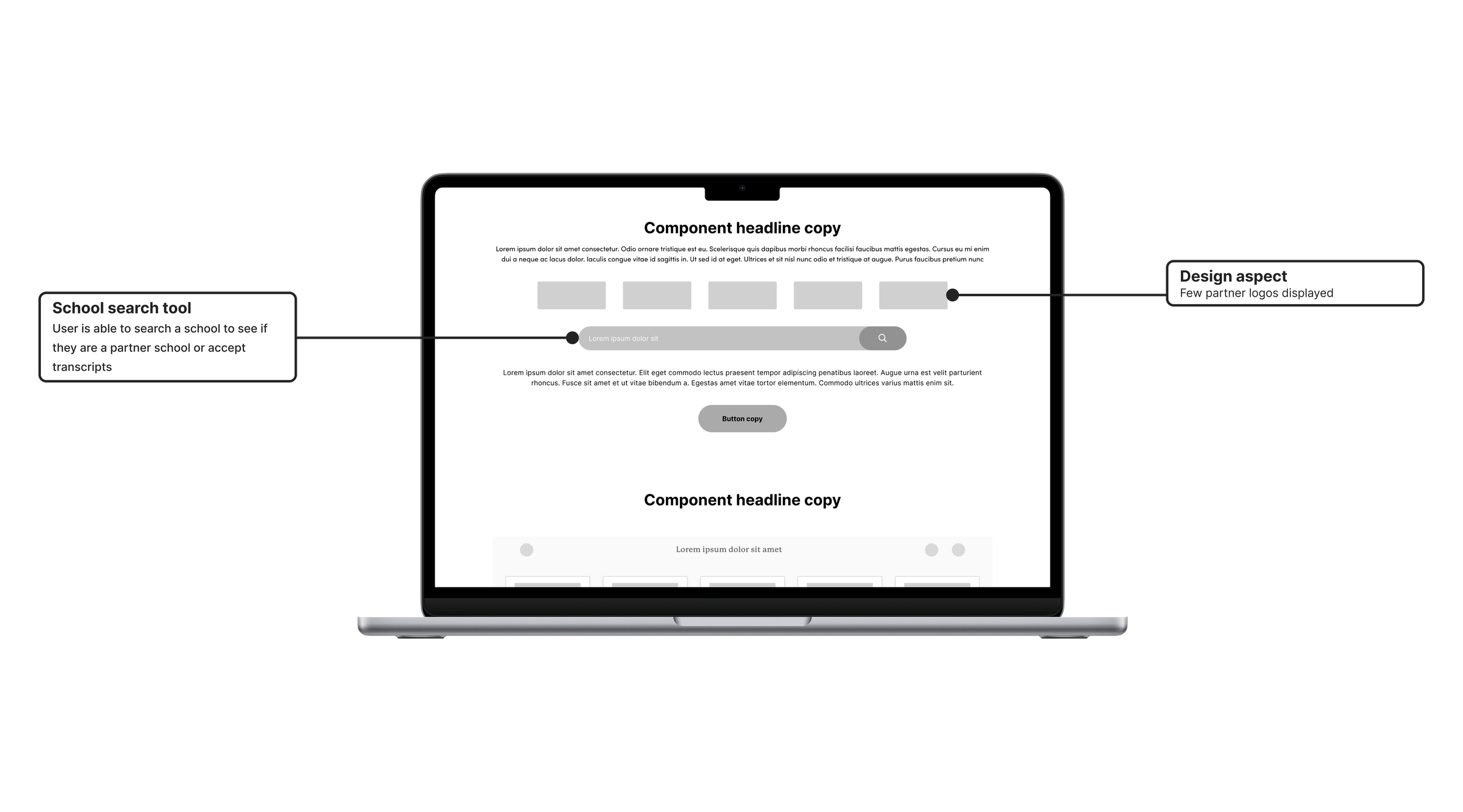
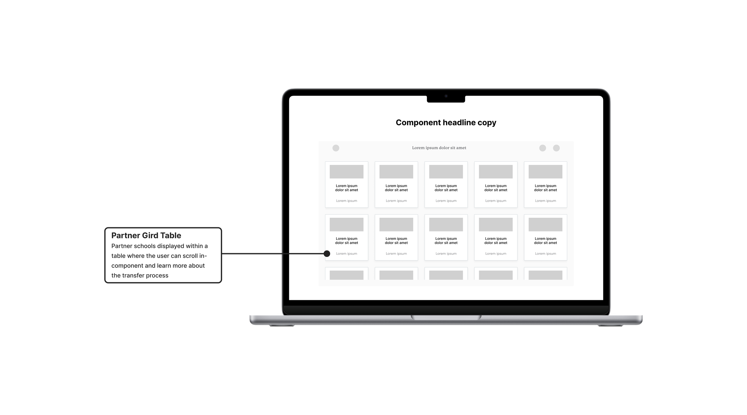
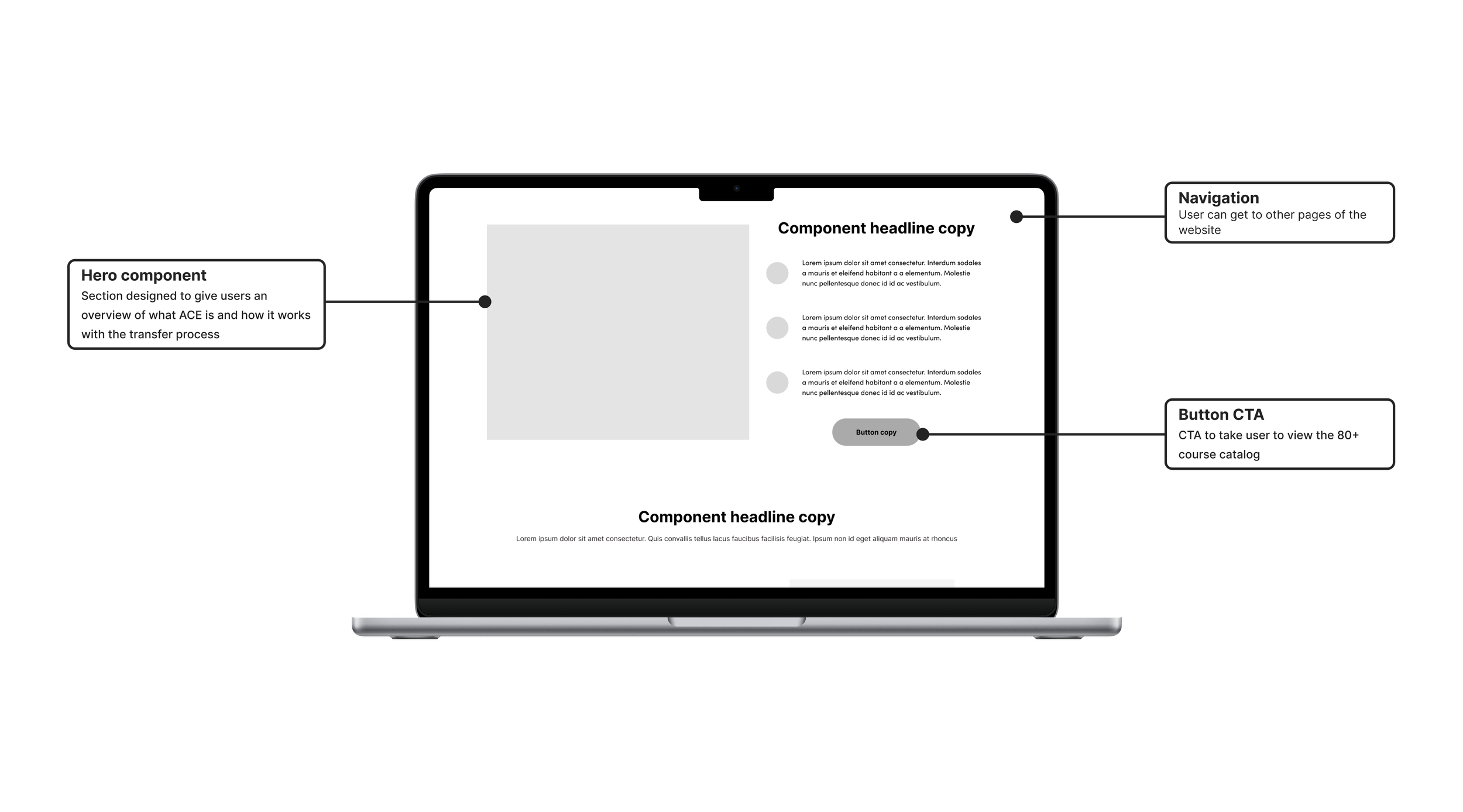
The layout included: a hero section - which gives an overview of the page, a jump-link navigation for smooth user experience, an overview and legend for the partner school search, Search tool for user to search if their school is a partner with Sophia, Partner school gird wall for users to visually see a list of the partner schools,Overview of Sophia’s Accreditation, Steps section for the user to see how to sign up for Sophia, Helpful resources section for more Sophia links, and a FAQ section for the user to have questions answered.




W I R E F R A M E S
Medium fidelity wireframe
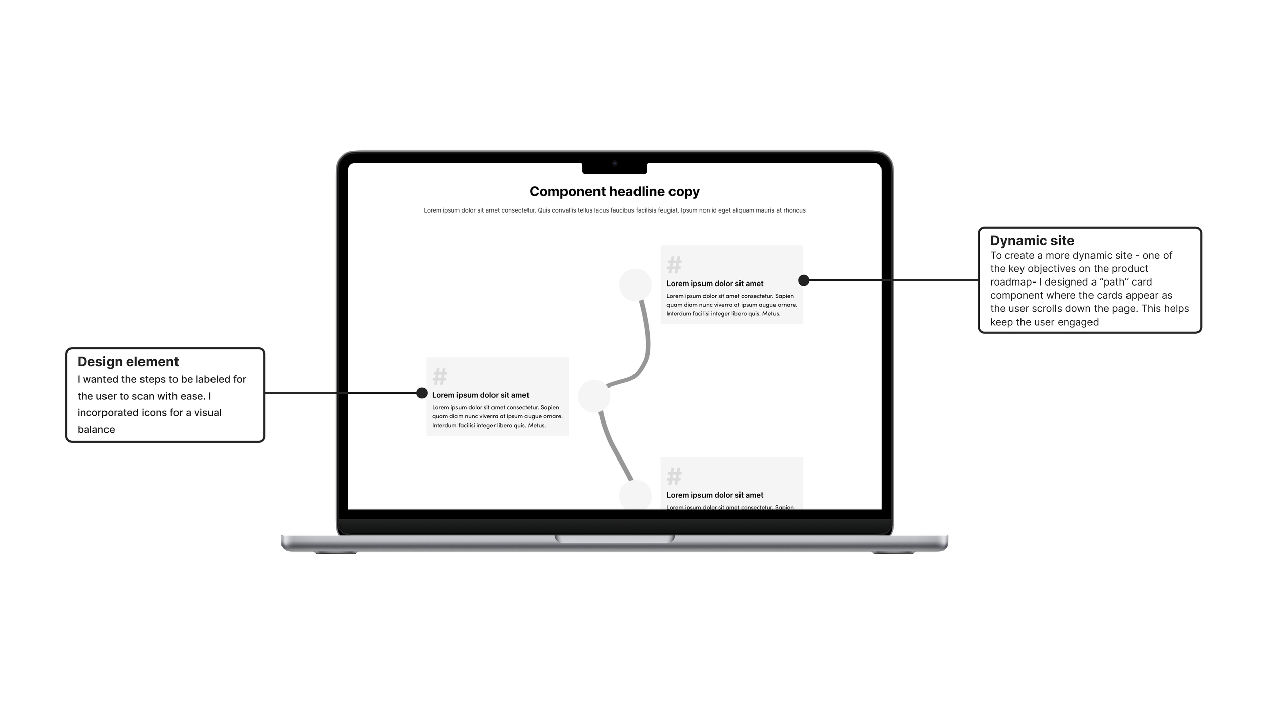
The medium-fidelity wireframe brought together the core structure and functionality of the redesigned page, with a focus on creating a clean, intuitive, and engaging user experience. The updated hero section introduced a simple, streamlined design, while a persistent jump-link component provided users with easy access to key sections as they navigated the page.
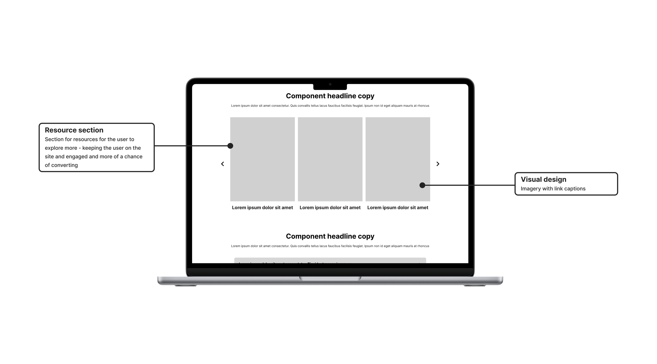
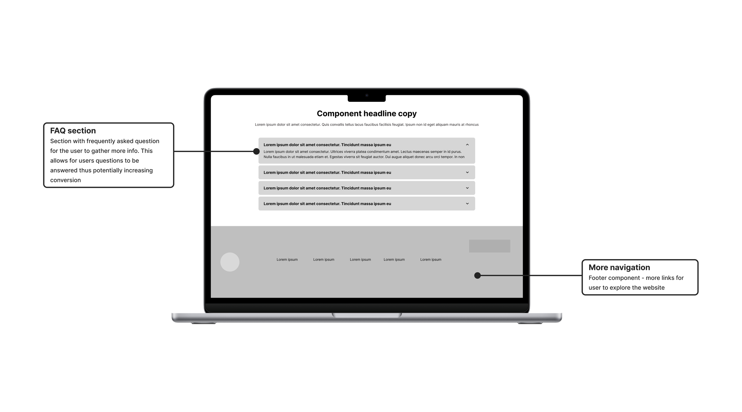
The search experience was redesigned to be more visually engaging and easier to use, while the partner grid showcased participating schools through their logos and clear calls to action. I also introduced a redesigned step-by-step section with subtle animation to encourage engagement, along with a content carousel that provided users with additional resources.
Finally, the FAQ section was modernized to improve visual hierarchy and make important information easier to find and understand.
U S E R T E S T I N G
U S E R T E S T I N G
Preference Test
After creating the high-fidelity mockups, I encountered a challenge while designing the search experience for the Partner Schools section. One of the main difficulties was determining how to organize Sophia’s different partner categories in a way that would be intuitive and easy for users to understand.
Sophia works with several types of institutions. Some schools are official Sophia partners, while others accept Sophia courses for transfer credit. I wanted to create a search experience that clearly communicated these distinctions without overwhelming users or making the navigation feel complicated.
To explore different approaches, I developed three potential organizational structures and conducted a preference test using Maze. Participants were presented with three design options and asked to select the image they found easiest to understand, followed by a short explanation of why they selected it. This allowed me to gain insight into user preferences and better understand how users naturally interpret and categorize partner institutions.
The preference test was presented to 80 participants. Option A organized the schools into four distinct categories, with partner institutions grouped within each category. Option B removed categorization entirely and presented all schools in a single, continuous list. Option C simplified the structure into two primary groups: Sophia Partners and Other Institutions. ADD CONTEXT ON WHAT THE PARTCIPANTS SAID
The goal of the test was to determine which organizational structure provided the clearest and most intuitive experience for users. The results helped inform the final direction for the Partner Schools search experience and ensured that the design was based on user behavior and preferences rather than assumptions.
R E S U L T S
Which of the images do you prefer?
Multiple Choice
Image C - Two groups 43%
Image A - Four groups 29%
Image B - One group 29%
80
Responses
34
23
23

B R A N D I N G
#D0DF00
#000000
#3F826D
#F9F9F9
#055973
#250E62
#FFFFFF
#F9F9F9
S O L U T I O N
S O L U T I O N
Results
Through strategic research, thoughtful planning, cross-functional collaboration, and effective coordination with internal development teams, I designed and delivered an updated Find Your School experience that addressed the original usability challenges while supporting Sophia Learning’s broader business objectives.
The redesigned experience resulted in significant improvements across key performance metrics: 124.9% increase in conversion rate, 103.5% increase in overall Sophia learning site, and Find your School page experience converted 96.8% higher than the overall Sophia experience. These results demonstrated the impact of combining user-centered design with data-informed decision-making and close collaboration across product, marketing, analytics, and development teams.
Ultimately, the project modernized a critical part of the Sophia Learning website while creating a more intuitive and seamless experience for users. The measurable improvements in engagement, subscriptions, and conversion validated the design direction and reinforced the value of a user-centered approach.
124.9%
Increase in conversion rates from the Find your School page experience
103.5%
Increase in conversion rates overall on the Sophia Learning site
96.8%
Higher conversion then the overall Sophia Learning experience
R E S P O N S I V E
C O M P L E T E D
K E Y T A K E A W A Y S
Final designs
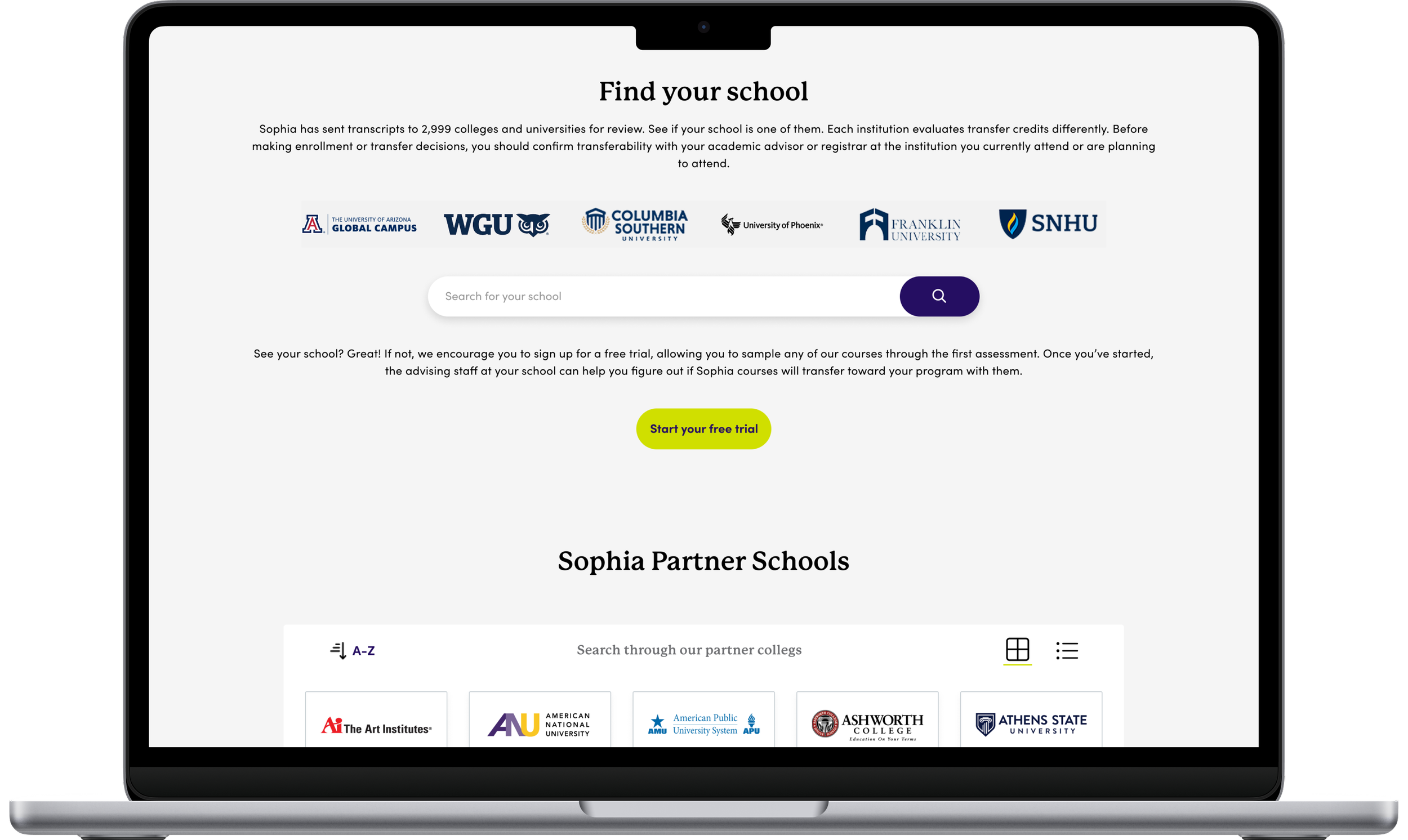
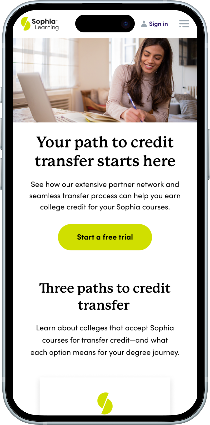
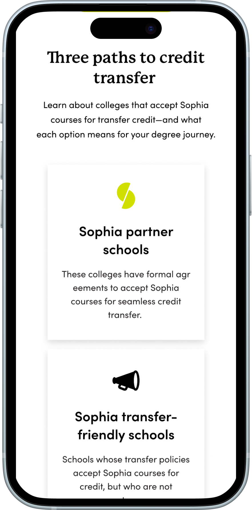
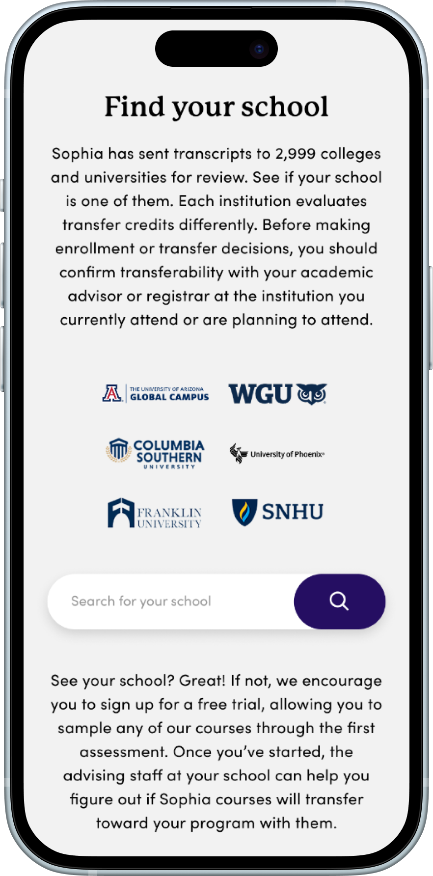
The final phase of the project focused on creating the high-fidelity designs and presenting them to key stakeholders for final review and approval. After completing discovery, conducting competitive research, collaborating with cross-functional teams, and iterating through wireframes and prototypes, I translated the validated concepts into a polished, production-ready design.
Following Sophia Learning's brand guidelines, I designed the experience using the established color palette, typography, iconography, and UI components to ensure consistency across the platform. My primary objective was to create a cohesive, modern, and intuitive experience that simplified the school search process while clearly communicating Sophia's transfer credit value.
Beyond improving usability, I aimed to create a visually engaging and welcoming experience for all audiences—including prospective and returning learners, as well as current and prospective partner institutions. The final design balanced user needs with business goals, delivering a streamlined experience that strengthened the brand, increased confidence in the transfer process, and supported higher engagement and conversion opportunities.