C A S E S T U D Y
C O M P O N E N T
CAPELLA PARTNER PAGE
O V E R V I E W
O V E R V I E W
About the project
Capella University is an accredited online institution focused on providing accessible, flexible higher education opportunities for working adults. Through partnerships with corporations and organizations, Capella offers employees access to education benefits and reduced tuition opportunities, helping make degree programs more accessible and affordable for working professionals.
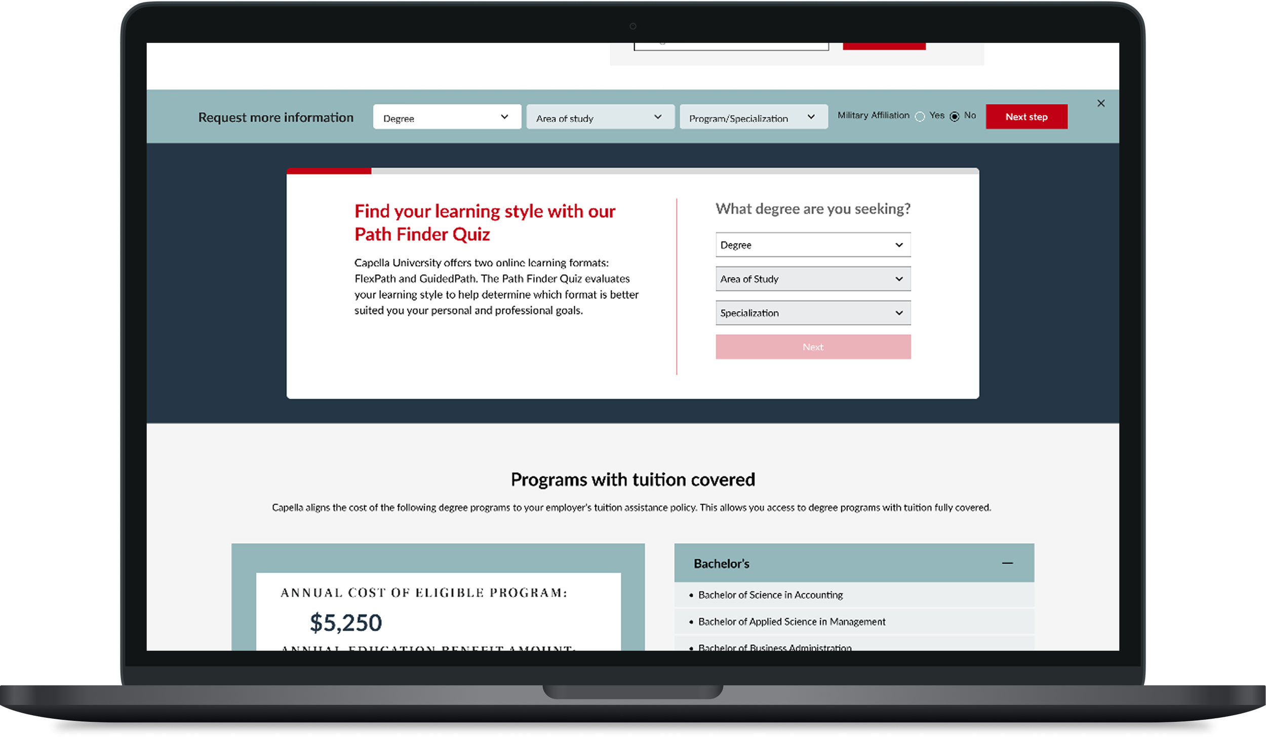
The goal of this project was to design a floating banner component on the Capella partner page to create a more modern, cohesive, and user-friendly experience. The existing banner, which encouraged prospective learners to submit a form for additional information, felt disconnected from the rest of the page and created unnecessary friction in the user journey.
The objective was to reimagine the form component as an engaging, intuitive call-to-action that complemented the overall page experience while making it easier for users to request more information. The redesign focused on improving visual hierarchy, enhancing usability, and aligning the banner with Capella's brand and design system.
By modernizing the floating banner, the project aimed to create a seamless user experience that increased engagement with the lead generation form, reduced friction in the conversion process, and supported the business goal of generating more qualified prospective student inquiries.
Scroll to see interactive prototype
O V E R V I E W
The challenge
The primary challenge of this project was addressing an outdated form experience on the that was negatively impacting usability and conversion opportunities. The existing form placement and design created friction within the user journey, making it difficult for users to discover and interact with the form intended to provide additional information.
Analytics and user behavior insights indicated that users were either overlooking the banner, becoming frustrated while navigating the page, or leaving before completing the conversion action. To improve the overall experience, the project focused on addressing three key areas:
User Experience: The existing interaction model did not provide a seamless experience for users. The goal was to create a more intuitive and accessible form experience that guided users toward the next step without adding friction to their journey.
Look and Feel: The original form design felt outdated and did not align with a modern digital experience. The redesign needed to create a visually engaging component that felt cohesive with the Capella brand and the overall partner page experience.
Layout and Placement: The form’s placement required users to search for the conversion opportunity, creating a missed engagement opportunity. The goal was to create a persistent, strategically placed component that remained visible and accessible throughout the user's journey without disrupting the page experience.
Overall, the challenge was to transform an outdated form into a modern, user-centered component that improved discoverability, enhanced engagement, and supported increased conversion rates.
O V E R V I E W
Design process
The project began with a comprehensive kickoff meeting with key stakeholders, Product Manager, Marketing Managers, Project Manager, Scrum Master, and Business Analysts to establish the business needs.
Following the kickoff, I conducted research to explore industry and competitive examples and gather inspiration for the form's visual redesign. Based on my findings, I identified a floating banner as the most effective solution.
I began the design process by creating initial sketches to explore how the floating banner could be integrated seamlessly with the existing page layout and surrounding components. Once the overall structure and interaction were established, I developed high-fidelity mockups and responsive designs.
I also created an interactive prototype to demonstrate the intended user flow and functionality. This helped ensure alignment between myself and the development team before implementation and provided developers with a clear reference for how the component should behave.
After development was completed, the component was transitioned to the Web Author for implementation. I collaborated closely with the Web Author throughout the build to review the final experience and identify visual inconsistencies.
The project was initially launched as a test to evaluate performance and user engagement before being fully deployed on the Capella partner page. The final component delivered measurable results, including a 33% increase in page visits and a 24% increase in conversion rates.
01
UX DESIGN LEAD
Role - Owned the end-to-end design process
02
EIGHT MONTHS
Duration - The project took a total of eight months
03
PRODUCT
Team - Collaborated with cross-functional teams
O V E R V I E W
Tools used
Throughout this project, I utilized a variety of tools to support project collaboration, design execution, development handoff, and user validation.
I used Asana to manage project communication and maintain alignment with key stakeholders, including the Project Manager, Product Owner, and Marketing Manager. Figma was the primary design tool used to bring the concept to life. I leveraged Figma to create initial sketches, low- and mid-fidelity wireframes, final high-fidelity designs, and an interactive prototype. During the development phase, I used Jira to collaborate with developers and Business Analysts, track implementation progress, and support the transition of designs into development sprints.
To measure the effectiveness of the new banner experience, I utilized Adobe Target to conduct a pre-post test and gather user insights. The project was initially launched as a test to evaluate performance and user engagement before being fully deployed on the Capella partner page. Together, these tools supported an end-to-end UX process—from discovery and design through testing, development, and final implementation.

T I M E L I N E
DISCOVERY
March - June
PROJECT KICKOFF
DESIGN
July - October
UX DESIGN
UI DESIGN
CONTENT
DELIVERY
November - March
DEVELOPER HANDOFF
PRE-POST TEST
LAUNCH
W I R E F R A M E S
W I R E F R A M E S
Ideations & sketches
Following the discovery phase, I moved into the ideation and concept development stage to explore potential solutions for the floating banner experience. After conducting research and reviewing the existing page structure, I began creating initial sketches to evaluate how the banner could be integrated seamlessly with the existing layout and supporting components.
The primary focus during this phase was ensuring the banner improved the user journey without creating additional friction. I explored different placement options, content hierarchy, and interaction patterns to determine the best approach for keeping the call-to-action visible while maintaining a clean and cohesive page experience.
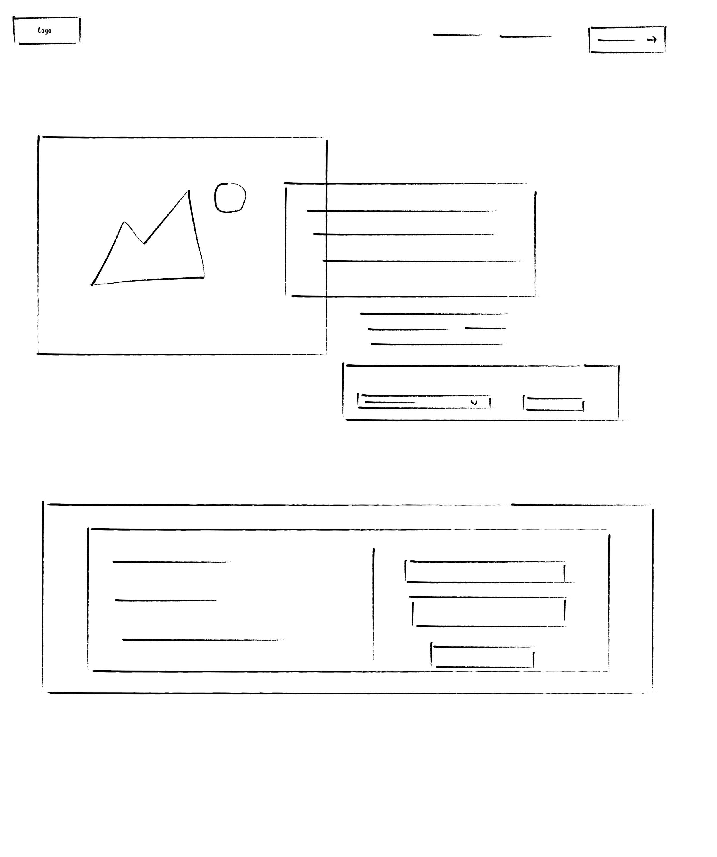
Initial page user sees when they first land on the site
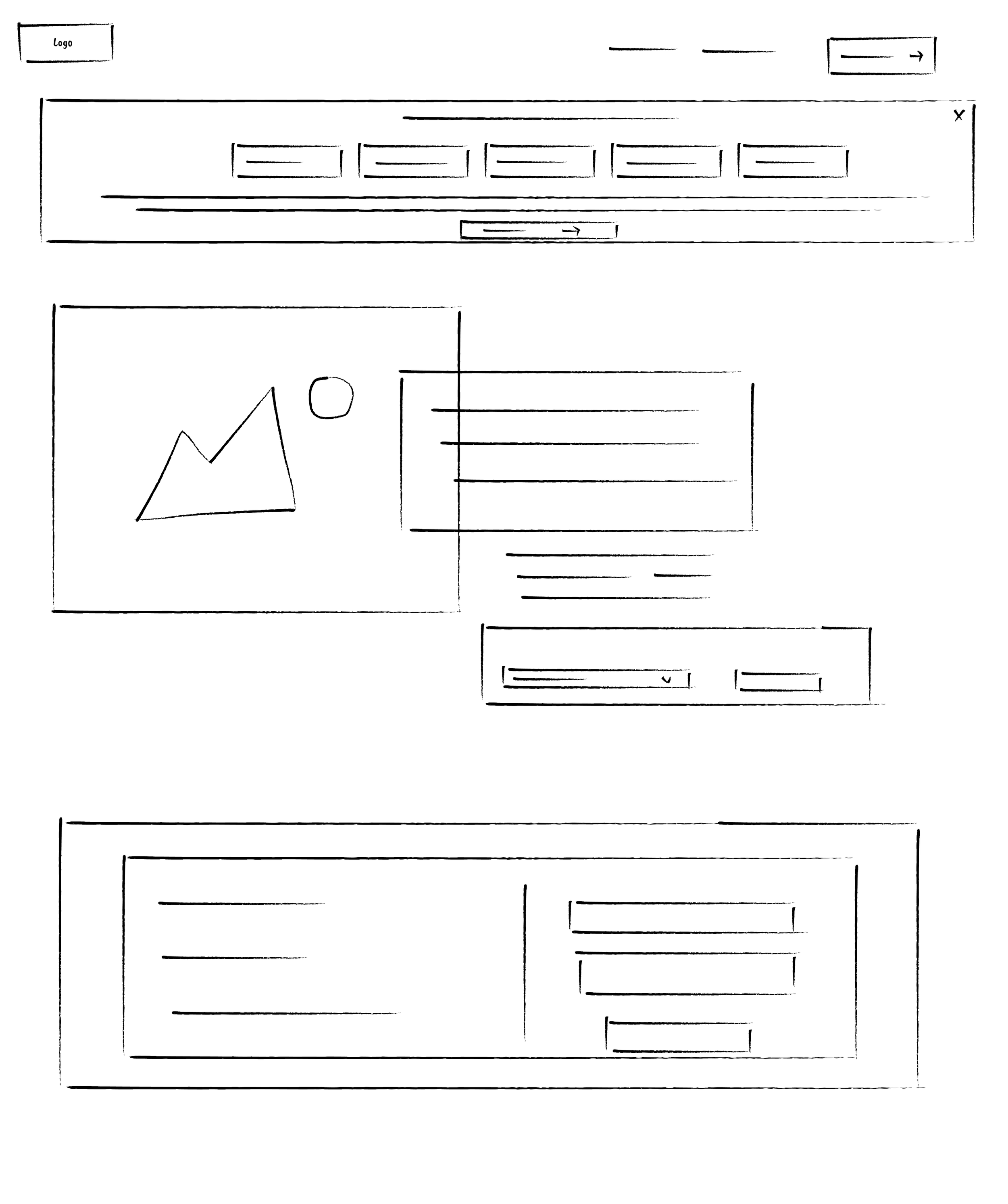
Step one — User chooses from drop downs
Banner appears when users scrolls slightly
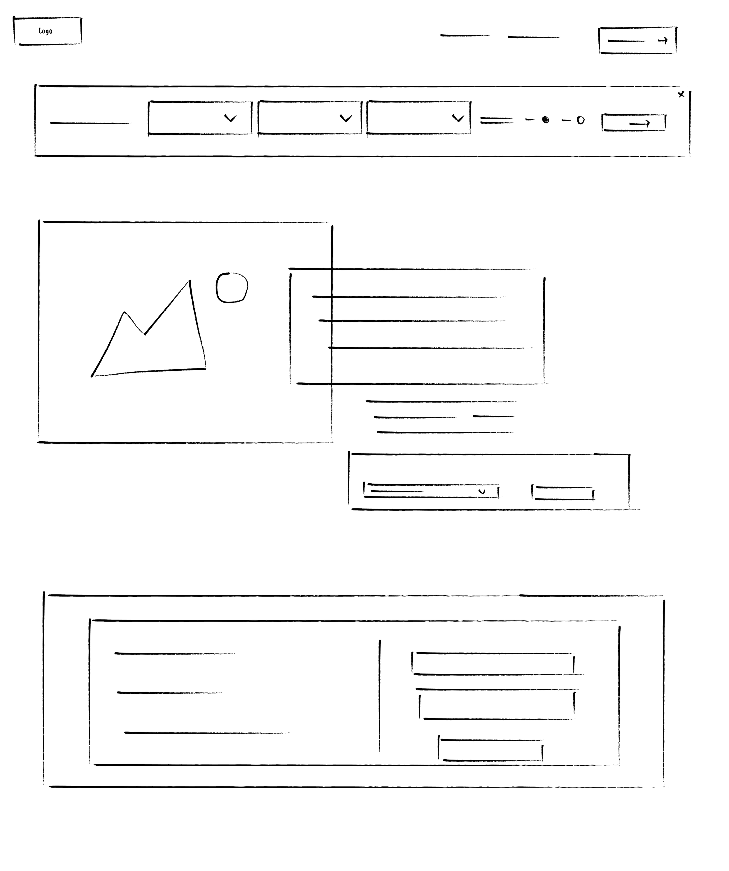
Banner stays sticky as user scrolls down page
Step two — User types in their info and presses next
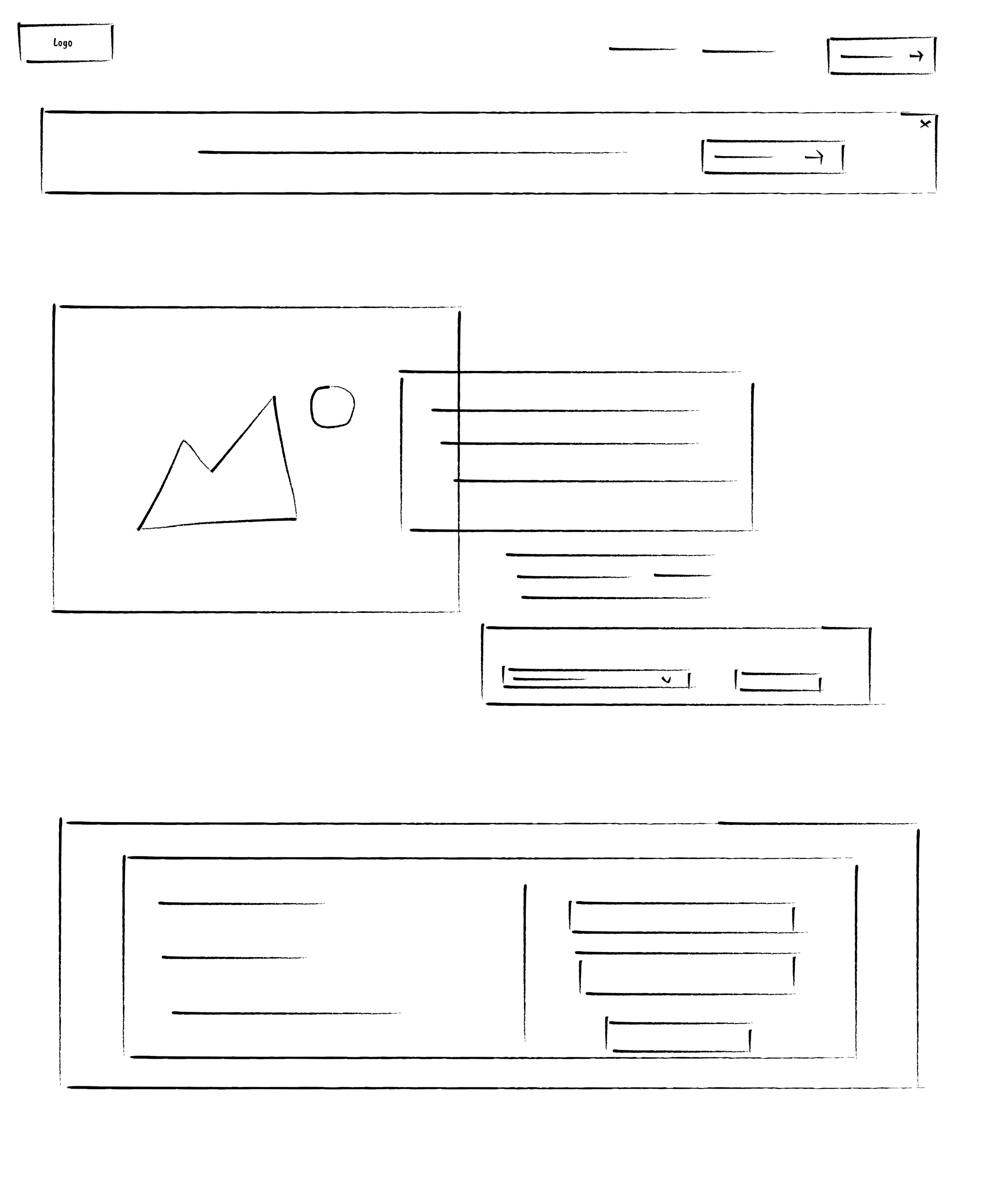
After step two, users is taken to the thank you screen
W I R E F R A M E
Low fidelity wireframes
Once I identified a direction that aligned with the overall page structure, I translated the concepts into low-fidelity wireframes. I collaborated closely with the Product Manager throughout this process to ensure the proposed solution supported business objectives while addressing the core user experience challenges identified during discovery.
By focusing on usability, accessibility, and a seamless interaction flow, I refined the wireframes until the experience felt intuitive and effective. After finalizing the wireframe structure and gaining alignment from stakeholders, I progressed into creating higher-fidelity mockups to further define the visual design and prepare the solution for testing and implementation.
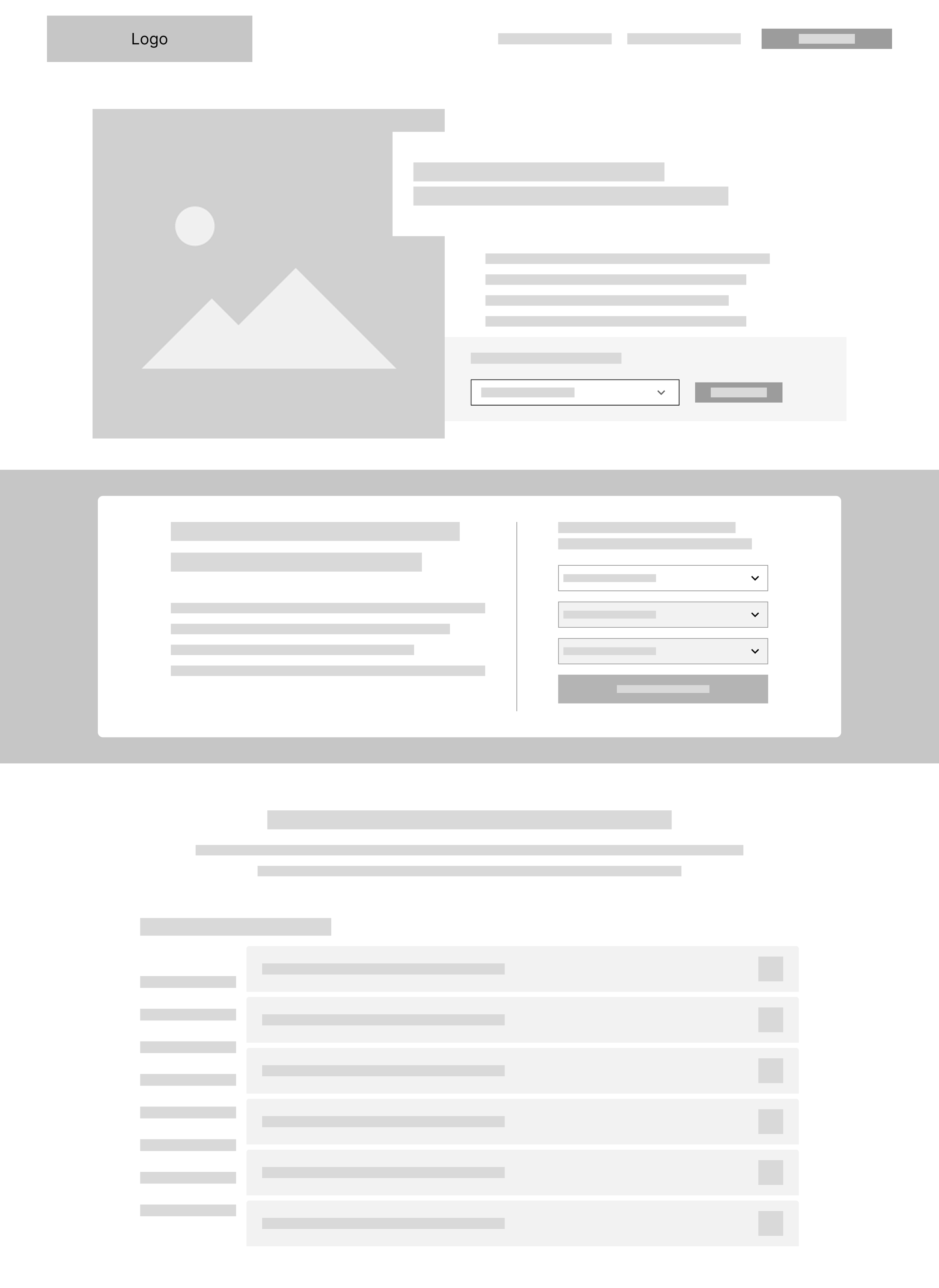
Initial step: What user sees when they first land on page
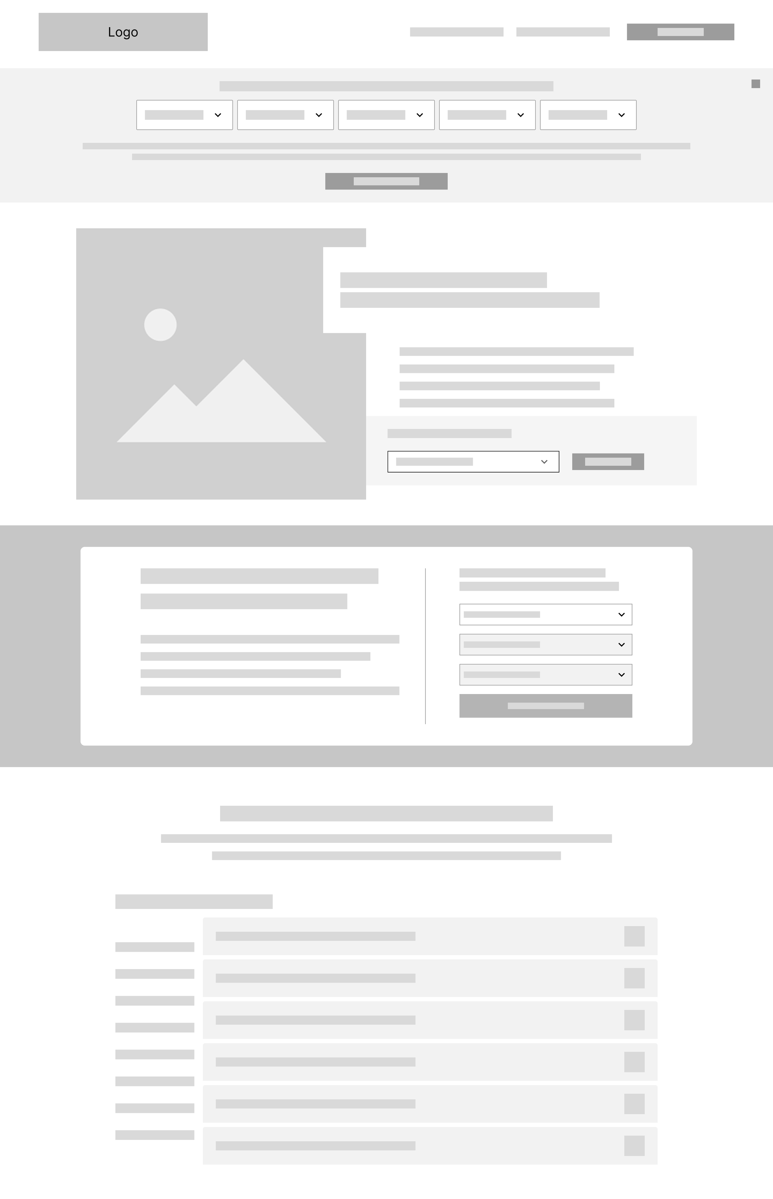
Banner appears: After user scrolls past hero section the banner appears
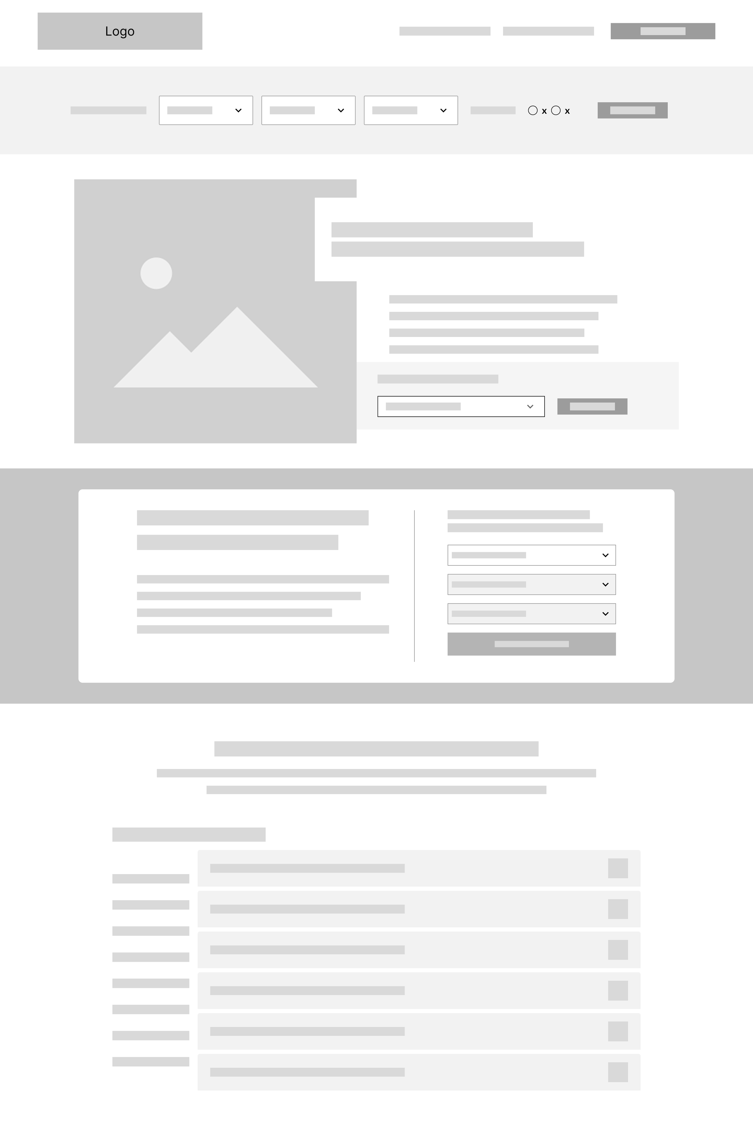
Banner stays sticky: Until user is ready to start filling out the form
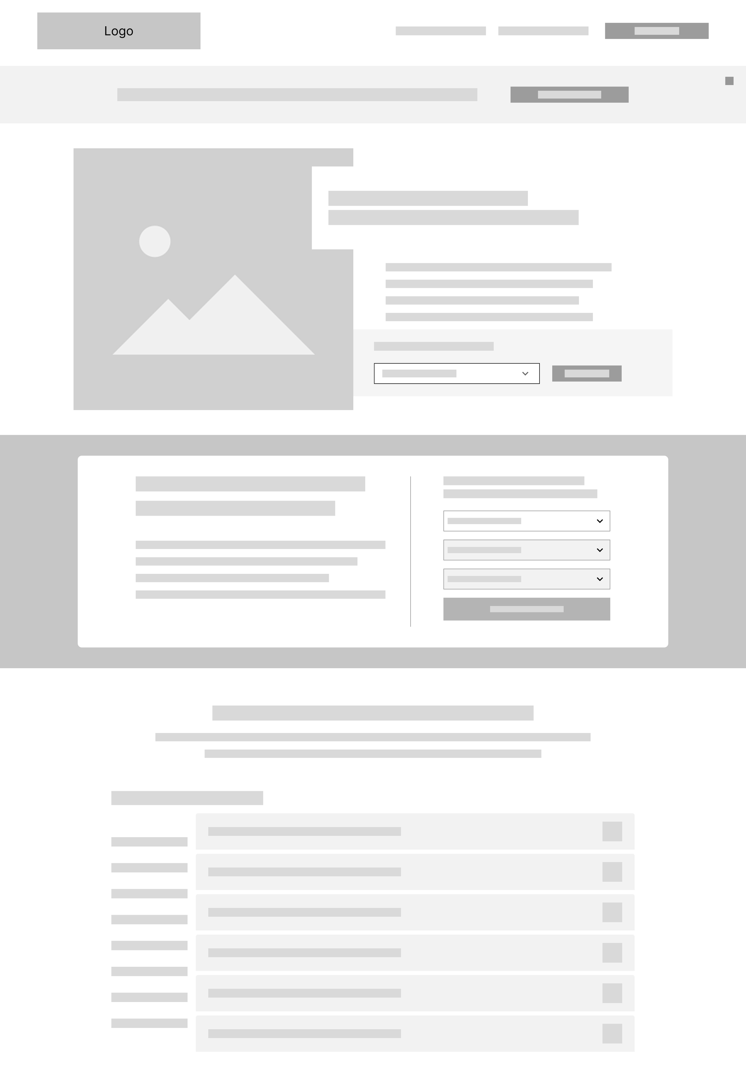
Final step: Banner is a two-step process - user fills out text fields and then hits submit
B R A N D I N G
#253746
#94B7BB
#8A8D8F
#C10016
#D9D9D6
#D3BC8D
#FFFFFF
#212322
S O L U T I O N
S O L U T I O N
Results
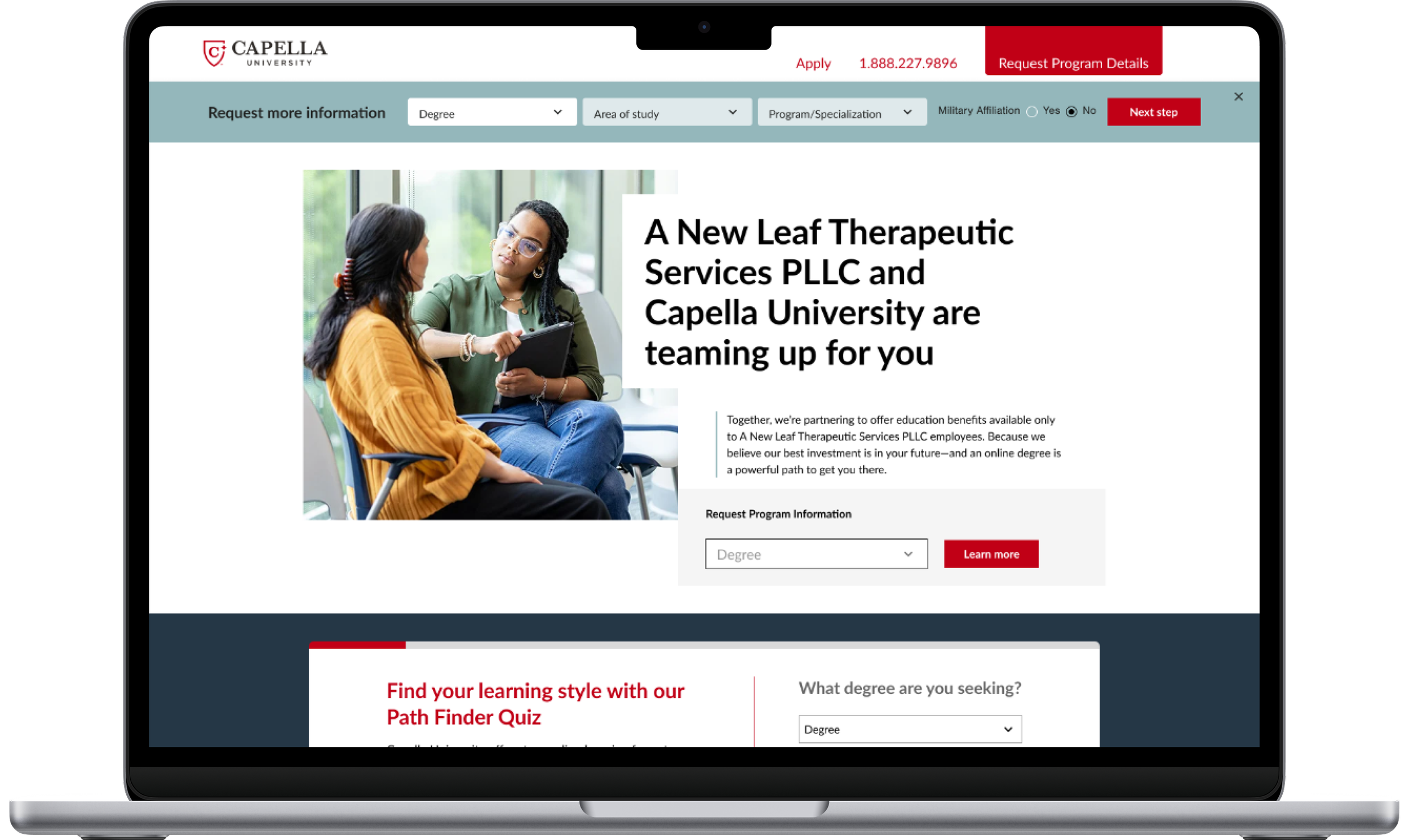
Through strategic research, thoughtful planning, and close collaboration with internal development teams, I designed and delivered a modernized floating banner that addressed the original usability challenges while aligning with Capella’s brand and business objectives.
The redesigned experience delivered measurable improvements across key performance metrics: 64.3% increase in page visits, 108.1% increase in conversion rates, and an 53.8% decrease in bounce rates
These results demonstrate the impact of a user-centered design approach that improved the banner’s visibility, usability, and overall effectiveness while creating a more seamless experience for users navigating the Capella partner page.
64.3%
Increase in page visits
108.1%
Increase in conversion rates
53.8%
Decrease in bounce rates
T A K E A W A Y S
T A K E A W A Y S
Final Designs
The final phase of the project focused on transforming the approved wireframes into polished, high-fidelity designs that were ready for development. I refined the visual design while ensuring the experience aligned with Capella's brand guidelines, incorporating the approved color palette, typography, and UI elements to create a modern and cohesive look.
The redesigned form featured a simple two-step conversion flow. Users could easily complete the required form fields, submit their information, and receive a confirmation message upon successful completion. The streamlined interaction reduced friction by providing a clear, intuitive process that made it easy for users to take action without interrupting their browsing experience. The result was a modern, user-centered design that improved discoverability, simplified the conversion experience, and supported the business goal of increasing user engagement and lead generation.