C A S E S T U D Y
B L O G
SOPHIA LEARNING
O V E R V I E W

O V E R V I E W
About the project
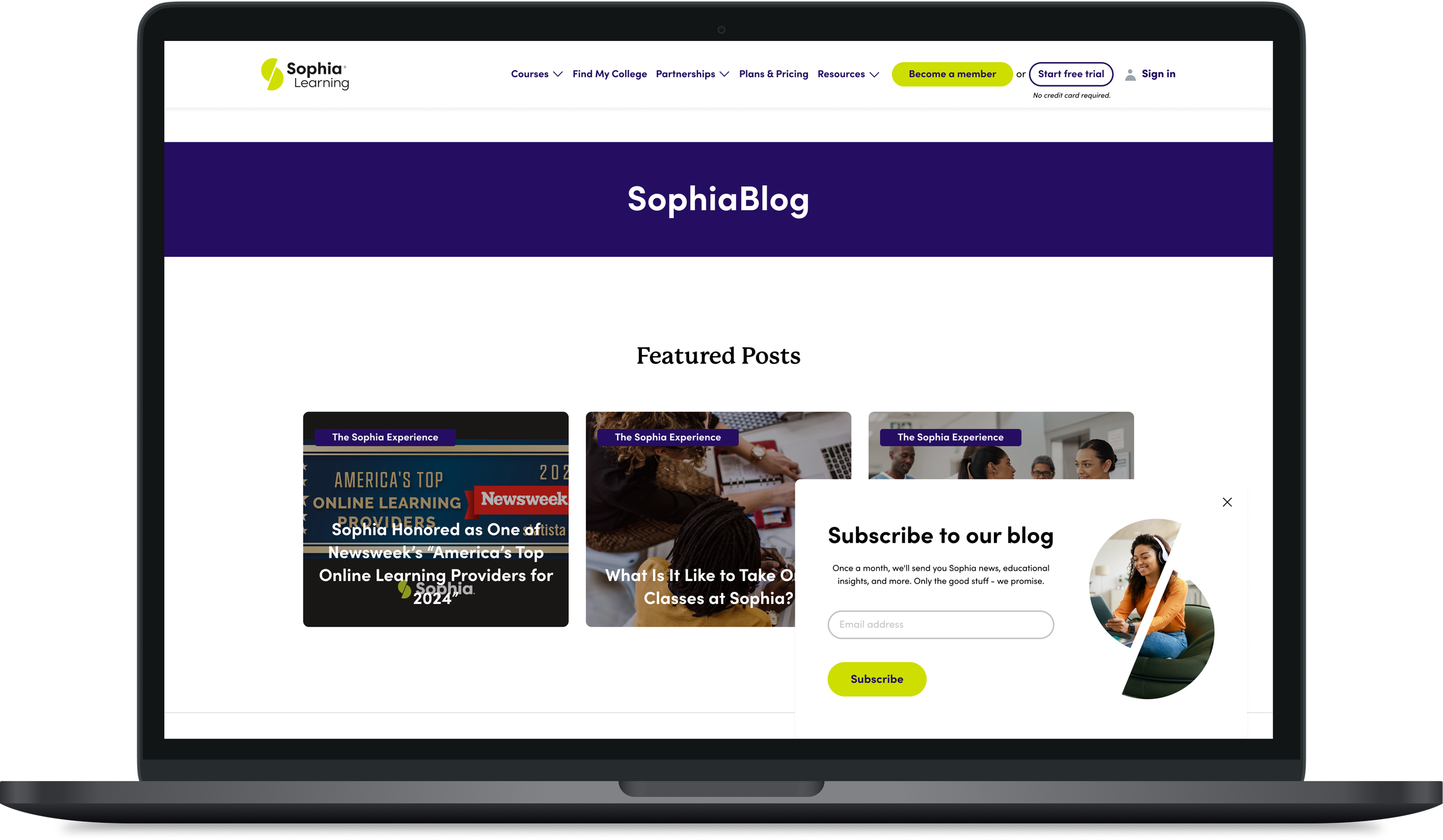
Sophia Learning is an online learning platform that offers over 80+ college-level credit courses. With a decade of experience, Sophia Learning provides affordable, self-paced courses accessible anytime and anywhere, catering to students at various stages of their educational journeys.
The primary goal of this project was to establish a dynamic and engaging blog for Sophia Learning. This blog served as a central hub for educational content, resources, and information related to online learning and college-level credit courses. Additionally, the blog was to aim to enhance search engine optimization (SEO), attract new users, and boost subscriptions to Sophia Learning. The blog will play a crucial role in enhancing user engagement, increasing visibility, and driving growth for Sophia Learning.
O V E R V I E W
The challenge
Developing a blog for an online college like Sophia Learning presented several challenges.
Content Development: Crafting engaging, high-quality content that resonates with a diverse audience of students and educators was a significant challenge. The blog needed to address topics that were both highly relevant to the target audience and aligned with Sophia Learning’s educational mission while also being an enjoyable experience for the user.
SEO Optimization: Ensuring the blog posts were optimized for SEO while maintaining readability and authenticity was a delicate balance. The content team needed to incorporate strategic keywords, meta descriptions, and backlinks to help boost search engine rankings.
User Engagement and Retention: Beyond attracting new users, maintaining long-term engagement with blog readers required a consistent flow of fresh content and interactive features, such as embedded videos and aesthetically pleasing call-out banners. I wanted to focus on creating an intuitive, easy-to-navigate experience that presented content in a clear and accessible layout, helping users find the information they needed while supporting their overall goals.
These challenges required careful research on user behaviors, consistent SEO efforts, collaborating with cross-functional teams and an ongoing focus on user engagement to ensure the blog became a valuable resource for both current and potential students.
O V E R V I E W
Design process
The project began with a comprehensive kickoff and onboarding session with key stakeholders to establish the project goals and business requirements. Following the kickoff, I began the research phase by conducting a competitive analysis and gathering key blog engagement metrics to better understand how users discover, navigate, and consume content. Because one of the primary challenges of the project was optimizing the blog experience for SEO, the research phase played an important role in informing the overall design strategy.
From there, I developed low-fidelity wireframes focused on creating a clear content hierarchy. I partnered with the User Research team to conduct usability testing, evaluating how participants interacted with the proposed blog layout and identifying areas for improvement.
Once I incorporated the user insights, I translated the wireframes into high-fidelity mockups using Sophia Learning’s established brand guidelines. I designed the page components and incorporated imagery, brand colors, iconography, and other visual elements to create a cohesive and engaging experience.
I then partnered with the Product Design Manager to prepare and transition the final designs to the development team. This project was my first experience leading a formal design-to-development handoff, providing an opportunity to strengthen my collaboration and documentation skills.
Once development was complete, I conducted a final design review to ensure the implementation aligned with the approved designs. I identified and addressed minor visual and functional refinements before providing final approval. The completed designs were then handed off to the Web Author for implementation, and the new blog experience was successfully launched.
The creation of the blog delivered measurable improvements to key business metrics, including a 26% increase in Sophia Learning subscriptions and a 44% increase in overall page visits to the .org site.
01
UX DESIGNER
Role - Collaborated with Product manager
02
SEVEN MONTHS
Duration - The project took a total of seven months
03
PRODUCT
Team - Collaborated with cross-functional teams
O V E R V I E W
Tools used
I utilized several tools to streamline the process and ensure efficient collaboration. Miro facilitated strategy development and user research, allowing for a clear visualization of workflows and user journeys. I created low, mid, and high-fidelity wireframes and mockups in Figma.
For communication with developers, Jira was instrumental in tracking progress and addressing technical concerns, while Asana was used for project management, keeping tasks organized and deadlines on track.



T I M E L I N E
DISCOVERY
September - October
PROJECT KICKOFF
DESIGN
November - January
RESEARCH
UI DESIGN
USER TESTING
DELIVERY
February - April
DEVELOPER HANDOFF
LAUNCH
R E S E A R C H
R E S E A R C H
Goals & objectives
For the research phase of this project, I worked with the user researcher and we conducted a competitive analysis of leading online college blogs to gather inspiration and identify key design elements. Our goal was to create a blog that not only provided an intuitive and user-friendly experience but also engaged readers with compelling content. We focused on understanding how other educational institutions structure their blogs, present information, and maintain user interest. This research informed my approach to ensuring the blog for Sophia stood out while maintaining simplicity and ease of navigation. Below are the key research objectives that guided my analysis.

Competitive analysis
Conducted a competitive analysis to identify gaps and opportunities and discover ways to enhance the design

Informal user testing
Ran informal user tests to evaluate how users were interacting with the designs

Conducted surveys
Gathered feedback from users about their experiences, and behaviors when interacting with blogs
R E S E A R C H
Competitor analysis
During the competitive analysis phase, I reviewed six key competitors—MasterClass, StraighterLine, CareerFoundry, Salesforce, Coursera, and WGU—to gather insights into how they structured and presented their blog content. I focused on comparing the layouts of homepages and individual blog post pages, as well as evaluating whether each blog categorized posts using specific category pages.
I analyzed each competitors blog and sticky noted based on components and design elements I thought would work well with the Sophia Learning blog. This analysis helped me identify best practices. For example, one competitor utilized floating social media icons for easy user access, which inspired my approach to integrating seamless social engagement features. Below is an example of what my analysis looked like:

Drop down menus to organize the tabs of the blog

Blog laid out in cards. Search option at the top of the page for user

Header banner when user lands on blog. Blog organized in sections

Card components with color coded category tags

Grid layout for blog posts. Blog posts are organized depending on relevance

Floating social icons follow user down the page as they scroll
R E S E A R C H
During the research phase, I gathered key user and engagement metrics to better understand how users interact with and consume blog content. These insights helped inform decisions around the blog’s structure, content hierarchy, and overall user experience.
My goal was to keep user needs at the center of the design process while understanding how frequently users engage with blog content, how much content they consume, and what factors influence their reading behavior. This research provided valuable insight into the user mindset and helped establish a data-informed foundation for designing a more engaging and effective blog experience.
Key metrics
29%
54%
The percentage of internet users who read blogs at least once per month
Source: Master Blogging
Of users who subscribe to a product after reading a blog post
Source: Data Box
61%
Percentage of people spending 3X more time consuming blog content than emails
Source: Option Monster
R E S E A R C H
User surveys
To gain a deeper understanding of user needs and behaviors, I worked with the User Researcher and conducted user surveys with respondents from various regions across the U.S. market. The survey focused on gathering insights about their experiences, habits, and preferences when using online educational blogs and resources. I asked respondents about their typical browsing habits, what features they found most useful, and any pain points they encountered while navigating blogs. These responses helped me identify common user needs, such as easy access to information, clear categorization of topics, and mobile-friendly designs.

51%
Of participants took online classes to get their college degree

33%
Of participants look at blogs or have looked at online college blogs for educational content
21%

Of participants said they referenced a blog from their online college to keep them up-to date
W I R E F R A M E S
W I R E F R A M E S
Ideation and sketches
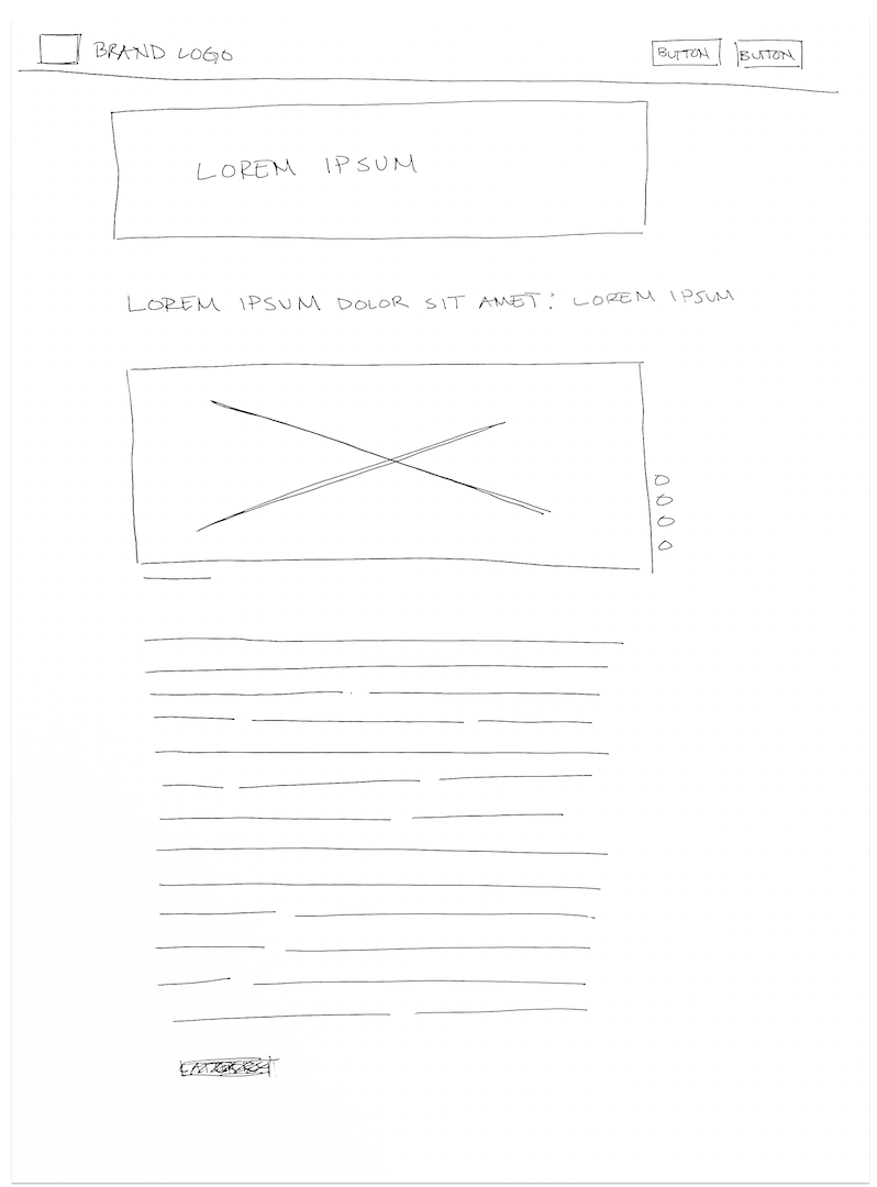
After completing the research phase, I transitioned to the wireframing process. I began by sketching the layout for both the homepage and individual blog post page. For the homepage, I envisioned a layout featuring clickable card components that display an image, headline, and short content blurb. To enhance the user experience, each blog card would include a category tag, organizing the homepage into easily navigable sections.
The homepage design included key elements such as a navigation bar, a headline banner, featured posts (highlighting the most popular content), the latest posts, and categorized blog sections. Once I finalized the homepage layout, I moved on to sketching the individual blog post page. Users would access this page by clicking on a blog card, and I designed it with clear breadcrumbs for easily navigate back to the homepage, followed by the blog's headline banner, title, image, date, byline, and content. I added a call-to-action (CTA) at the bottom, encouraging users to sign up for a Sophia Learning subscription. Drawing from my competitive analysis, I integrated floating social sharing buttons that follow the user down the page and designed a sidebar for users to subscribe to Sophia’s monthly newsletter. These sketches focused on creating a streamlined, user-friendly experience, offering all necessary information without overwhelming the user. See sketches below:
Landing page

Blog page
W I R E F R A M E S
Low Fidelity Wireframes
Once I finished the initial sketches for the homepage and blog post page, I shared them with my team, including the product manager, SEO manager, design manager, and scrum master, to gather feedback on the layout and functionality. Based on their insights, I began creating low and mid-fidelity wireframes to refine the design. These wireframes served as a more detailed visual skeleton of the pages, giving a clearer sense of how the elements would be structured. I also developed a small user flow to visualize how users would navigate through the blog. The low-fidelity wireframes outlined the design of key components such as the clickable card elements, section spacing, and overall layout. For the blog post pages, I focused on designing a user-friendly experience with clear content hierarchy, and integrated design elements. Once the wireframes were reviewed and approved by the team, I progressed to creating the high-fidelity designs.

B R A N D I N G
#D0DF00
#000000
#3F826D
#F9F9F9
#055973
#250E62
#FFFFFF
#F9F9F9
S O L U T I O N
S O L U T I O N
Results
Through strategic research, thoughtful planning, and close collaboration with development teams, I designed and delivered a modern blog experience that addressed the original business challenge of increasing subscriptions while supporting Sophia Learning’s mission.
The blog delivered measurable improvements across key performance metrics: 43.5% increase in subscriptions, 97.4% increase in conversion rates, 164.3% increase in overall SEO performance. The new blog created a more engaging and intuitive content experience while effectively supporting Sophia Learning’s broader goals for user engagement, conversion, and subscription growth.
43.5%
Increase in subscriptions
97.4%
Increase in conversion rates
164.3%
Increase in SEO performance
T A K E A W A Y S
T A K E A W A Y S
Final Designs
After completing the final designs and handing them off to the development team, the blog successfully went live, leading to notable improvements in Sophia Learning’s online presence. The blog increased SEO performance by 164.3%, boosted user subscriptions on the .org site by 43.5%, and attracted new blog subscribers on a monthly basis. Key takeaways from this project included the importance of effective communication and collaboration with teammates, and developing my handoff and design skills. I had to balance meeting stakeholder expectations with ensuring the blog’s aesthetic appeal and usability to engage users. This project deepened my involvement in user research. It highlighted the critical role of thorough research in UX design and taught me how to manage a project from ideation to final product.

