

C A S E S T U D Y
Find my College Page Refresh
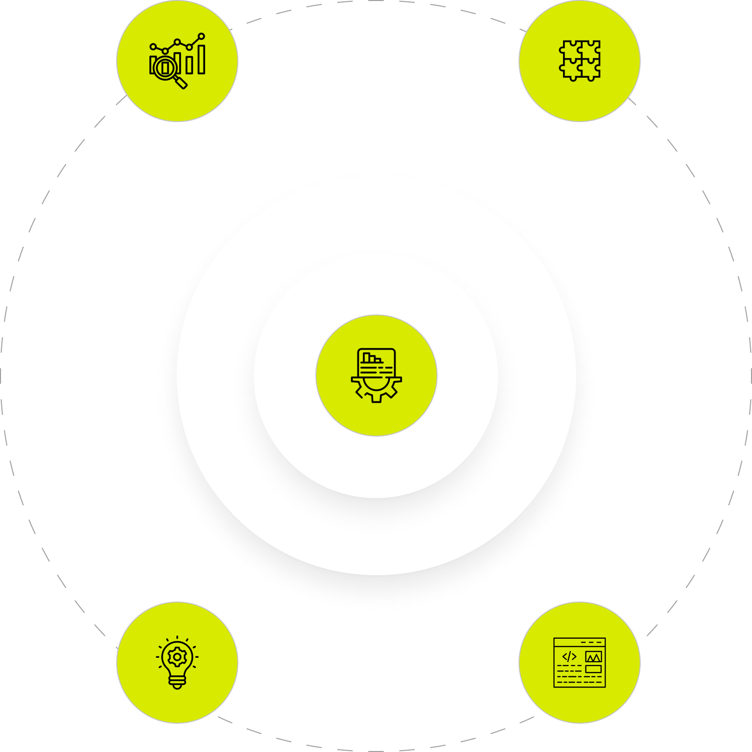
PROJECT OVERVIEW

O V E R V I E W
The Solution
The solutions implemented in creating the savings calculator focused on simplifying the user interface and streamlining the user experience. A clean, straightforward design with only a few essential input fields kept users engaged, reducing frustration and making the tool more accessible. Ensuring that users could quickly input their information and receive instant results addressed both usability and accessibility challenges, enhancing the overall experience.
Through research and informal testing, the ideal placement for the tool was identified—the pricing page—where users could easily discover their savings and make informed decisions about which plan to choose. Ultimately, by providing instant savings results, the calculator successfully increased conversion rates and subscriptions.
Developing the savings calculator came with several hurdles, primarily related to simplifying user experience, optimizing functionality, and deciding on tool placement.
Streamlining Functionality: One of the main challenges was refining the functionality to create a smooth and intuitive user flow. The previous tool had too many steps, leading to user frustration and drop-offs. The goal was to eliminate unnecessary steps, ensuring users could instantly and easily view their savings without confusion or delays.
Instant Results and Efficiency: A significant challenge was designing the calculator to deliver immediate results. Unlike traditional tools that might require multiple inputs or page transitions, this tool needed to provide results instantly while minimizing user effort. Balancing accuracy with speed was essential to maintain user trust in the results without overwhelming them with complexity.
Visibility and Accessibility: Ensuring that all input fields and relevant information were visible upfront was a key design challenge. The previous version buried fields behind extra clicks or steps, making it hard for users to navigate. This new version had to make all fields accessible in a single component, enhancing clarity and reducing friction in the user journey.
Page Retention: Another obstacle was ensuring the user could interact with the tool without being redirected or taken off the page. Keeping users on the same page provided a more fluid experience, avoiding page reloads or additional navigation steps that could increase the risk of abandonment.
Tool Placement: Deciding where the savings calculator would live on the site posed a strategic challenge. It had to be placed in a location where it would naturally attract attention, but not disrupt the overall site design or other user interactions. Balancing visibility, usability, and site navigation was crucial to its effectiveness.
The project required thoughtful consideration of user experience, technical constraints, and design placement. Addressing these challenges successfully meant delivering a faster, more accessible, and friction-free tool that would ultimately increase user engagement and conversion rates for Sophia.
O V E R V I E W
About the project
The goal of this project was to design and develop a user-friendly savings calculator for an online college, Sophia, to help prospective students estimate their potential savings. By entering the number of courses they plan to take with Sophia, users receive an estimated dollar amount in tuition savings compared to traditional college or university courses.
Features:
User Input: Users can input the number of courses they are interested in taking through Sophia.
Cost Comparison: The tool calculates and displays the tuition savings compared to traditional institutions.
Clear Value Proposition: The savings amount is highlighted to underscore the affordability of Sophia courses.
Account Creation: After receiving the savings estimate, users are prompted to create an account to access more details and begin enrollment.
The primary objective was to increase the conversion rate of site visits by encouraging users to create accounts with Sophia. The savings calculator was designed to serve as a compelling tool for prospective students to easily understand the financial benefits of choosing Sophia courses, driving them to sign up and explore further educational opportunities.
O V E R V I E W
The Challenge
O V E R V I E W
Tools used
Tools used: Procreate tool for initial sketches, Figma for Whiteboard, competitive analysis, wireframing and final designs, Asana for project management, Jira for communication with developers,


EXPLORATION
E X P L O R A T I O N
Scope of work & responsibility

Research
To understand user behaviors, needs, and motivations and to gather insights that inform the design process

UX Design
Ensure the product is easy to use & enjoyable by addressing users' needs and problems through design solutions.

UI Design
Ensures that a product’s interface is aesthetically pleasing, consistent, and easy to navigate
Prototyping
Creating a mockup to test and visualize its design, functionality, and user interactions.
WORK PROCESS
P R O C E S S
DISCOVERY
November - December
RESEARCH Competitor analysis & Ideations
Project Timeline
DESIGN
January - February
UI Design Main flow & Future concept
DELIVERY
March - April
INTERFACE Interactions & Final design
RESEARCH PROCESS
R E S E A R C H
Competitor analysis
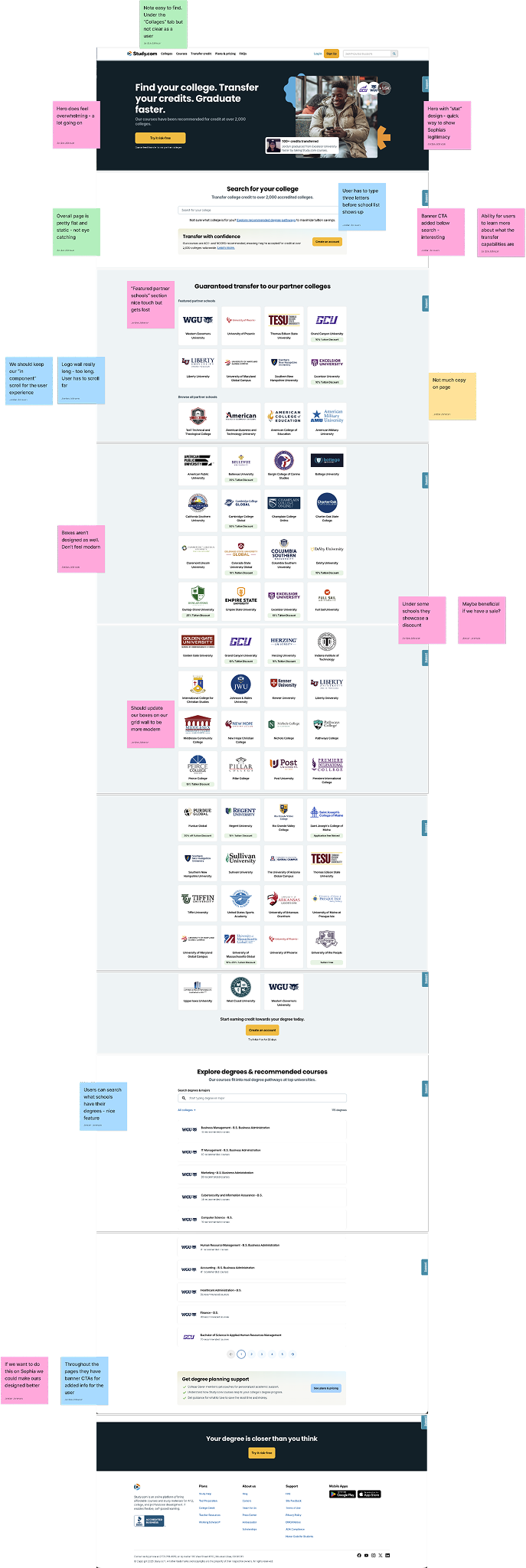
For the competitor analysis phase of the " Find Your School “ page I analyzed Straighterline, Study.com, and EdX
Lorem ipsum dolor sit amet consectetur adipiscing elit. Quisque faucibus ex sapien vitae pellentesque sem placerat. In id cursus mi pretium tellus duis convallis. Tempus leo eu aenean sed diam urna tempor. Pulvinar vivamus fringilla lacus nec metus bibendum egestas. Iaculis massa nisl malesuada lacinia integer nunc posuere. Ut hendrerit semper vel class aptent taciti sociosqu. Ad litora torquent per conubia nostra inceptos himenaeos.
Lorem ipsum dolor sit amet consectetur adipiscing elit. Quisque faucibus ex sapien vitae pellentesque sem placerat. In id cursus mi pretium tellus duis convallis. Tempus leo eu aenean sed diam urna tempor. Pulvinar vivamus fringilla lacus nec metus bibendum egestas. Iaculis massa nisl malesuada lacinia integer nunc posuere. Ut hendrerit semper vel class aptent taciti sociosqu. Ad litora torquent per conubia nostra inceptos himenaeos.
Sticky note legend
Banner CTA added below search - interesting
Like the filtering aspect - CTA does get lost again
Pink Sticky notes: The pink sticky notes represent anything on the competitors site that has to do with design. Could be a good design feature, bad design feature, something we might want to explore creating on Sophia
Yellow Sticky notes: The yellow sticky notes represent any and everything copy related. Do you like the competitors copy? Do you think they are speaking to the users well? Anything you would change?
Green Sticky notes: The green sticky notes represent anything content or layout related. Does the content flow well? Would you change anything about the layout or content?
Blue Sticky notes: The blue sticky notes represent anything UX related — how the experience feels for the users, any changes you would make on the competitors site that you feel we should have on ours.
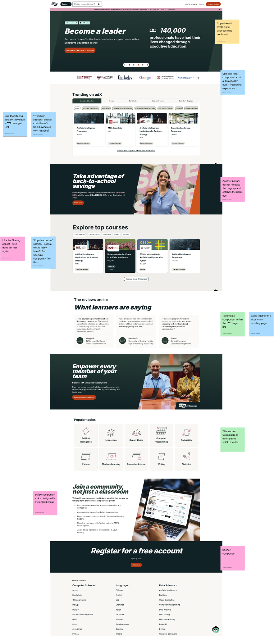
EdX
Sticky notes sorted
Card design - Individual cards with a slight design
Overall copy on this competitor does feel straightforward - slightly redundant
Overall page is pretty flat and static - not eye catching
Throughout the pages they have banner CTAs for added info for the user
FYS search is right as the user lands on the page - Sophia’s should be below the overview
If we want to do this on Sophia we could make ours designed better
Banner component
50/50 component - nice design with the angled image
Each section describes the purpose of the top school category
Resource section - larger cards may not work for Sophia too similar to resource library look
Users can search what schools have their degrees - nice feature
Adds trust for the user when scrolling page
Boxes aren’t designed as well. Don’t feel modern
Hero does feel overwhelming - a lot going on
Banner design - would be beneficial to break up pages
Copy doesn’t explain a lot - user could be confused
Two box display for more content or links - breaks the page up
“Trending” section - Sophia could benefit from having our own - maybe?
User has to type three letters before school list shows up
Main takeaways
Lorem ipsum dolor sit amet, consectetur adipiscing elit, sed do eiusmod tempor incididunt ut labore et dolore magna aliqua. Ut enim ad minim veniam, quis nostrud exercitation ullamco laboris nisi ut aliquip ex ea commodo consequat. Duis aute irure dolor in reprehenderit in voluptate velit esse cillum dolore eu fugiat nulla pariatur. Excepteur sint occaecat cupidatat non proident, sunt in culpa qui officia deserunt mollit anim id est laborum.
High
These take aways are top priority. We want to implement them within Q2 or early Q3
Medium
These take aways aren’t as top priority but still want to implement within the next few quarters
Low
These take aways are not as important to implement but could be beneficial at other times
“Featured partner schools” section nice touch but gets lost
Currently have a new FAQ in development
Should update our boxes on our grid wall to be more modern
Not much copy on page
“Top” Schools sectioned off into different categories - Pro
We should keep our “in component” scroll for the user experience
Straighterline
Study
Maybe beneficial if we have a sale?
Updated FAQ theirs is a 50/50 version - don’t think we need to change ours
50/50 section with check marks - could consider building a component like this?
Copy in overview section feels straight forward as a user
Testimonial component within the FYS page - pro
Logo wall really long - too long. User has to scroll far
Create an updated Two box component
Currently the Sophia Component Library has a 2 box design but we could update this to be more modern and for multiple use cases
ACE badge image
Create an ACE badge image for the ACE accredited section
Existing components
Should utilize new components that have been built over the past year
Testimonials
Add testimonial (existing) component to the page for new users to hear current users stories
Transfer credit badge
Create a badge for transfer credit schools to display throughout sections - add more legitimacy for users
Lorem ipsum dolor sit
Lorem ipsum dolor sit amet, consectetur adipiscing elit, sed do eiusmod tempor incididunt ut labore et dolore magna aliqua.
The design of the overview section is straight to the point and a nice touch with the icons
Same design as our partner “list” view - Should keep
Hero with “stat” design - quick way to show Sophia’s legitimacy
Note easy to find. Under the “Collages” tab but not clear as a user
“Popular courses” section - Sophia would really benefit from having a component like this
Under some schools they showcase a discount
Transfer Credit badge - nice design and breaks up list view
This section takes users to other pages within the site
Scrolling logo component - not automatic like ours - frustrating experience
Bring over resource component
Currently we have designed a new “Helpful Resources” component for the course page and think it will be beneficial for the FYS page - will keep the user engaged
Update “overview” section
Need to make it known to the user what the page is for right as they land on the page but want to do that in a visually appealing way
Page layout
Keep page consistent and straight forward for user
Popular courses filters
For the popular courses section there maybe could be a filter for users to decide if they want certain categories of courses
Updated partner grid
Find a way to update the component grid wall slightly - keep in-component scroll but maybe make tiles more modern? Add tags?
Lorem ipsum dolor sit
Lorem ipsum dolor sit amet, consectetur adipiscing elit, sed do eiusmod tempor incididunt ut labore et dolore magna aliqua.
Ability for users to learn more about what the transfer capabilities are
Another banner design - breaks the page up and catches the users eye
Like the filtering system they have - CTA does get lost
Add a “Top School” component
Straigherline has “Top Nursing schools” etc. sections throughout the page - We should do something that showcases different sections of school (i.e. nursing, business etc.)
Banner component for major call outs
We currently only use “Call out banners” on the Blog but think it would be beneficial to have on the site for additional info
Dynamic page
Add more dynamic elements to the page for more interaction with user - Already have search functionality updated and path steps component but need to add one more element
Page length
Competitors pages are a bit too long, I think ours should not be too long because that would be a frustrating experience for the user - want to keep that in mind
Copy v. imagery
Design note - keep a healthy balance of just the right copy to explain to the user what is needed and imagery to break the copy up
Lorem ipsum dolor sit
Lorem ipsum dolor sit amet, consectetur adipiscing elit, sed do eiusmod tempor incididunt ut labore et dolore magna aliqua.
INFORMATION ARCHITECTURE
I N F O R M A T I O N A R C H I T E C T U R E
Ideation & sketch
After completing the competitor analysis, I began ideation sketches to shape the overall look and functionality of the savings calculator. My primary goal was to keep the user experience simple and efficient by minimizing the number of input fields. I envisioned a split-screen layout, with input fields on the left and results displayed on the right, ensuring users had everything in one view for convenience. During the sketching process, I realized that only two input fields were necessary, so I opted for sliders instead of manual inputs to streamline the experience and reduce the potential for user errors. This approach ensured a fast, intuitive interaction for the user while maintaining clarity and ease of use.
Screen 1
Screen 2
I N F O R M A T I O N A R C H I T E C T U R E
Low fidelity wireframe
After finalizing the sketches, I transformed them into low-fidelity wireframes and presented them to the product manager. One challenge raised during this phase was the need to incorporate legal copy directly within the calculator component. Initially, I had placed the legal text below the component, but the product manager requested that it be more visible within the tool itself. To address this, I explored various layout options and ultimately decided to position the legal copy alongside the results, beneath the call-to-action button. This placement ensured that users could see all relevant information, including legal disclaimers, before proceeding to sign up, keeping the layout clean while meeting legal requirements.

USER TESTING
U S E R T E S T I N G
Heat map
Lorem ipsum dolor sit amet consectetur adipiscing elit. Quisque faucibus ex sapien vitae pellentesque sem placerat. In id cursus mi pretium tellus duis convallis. Tempus leo eu aenean sed diam urna tempor. Pulvinar vivamus fringilla lacus nec metus bibendum egestas. Iaculis massa nisl malesuada lacinia integer nunc posuere. Ut hendrerit semper vel class aptent taciti sociosqu. Ad litora torquent per conubia nostra inceptos himenaeos.
Lorem ipsum dolor sit amet consectetur adipiscing elit. Quisque faucibus ex sapien vitae pellentesque sem placerat. In id cursus mi pretium tellus duis convallis. Tempus leo eu aenean sed diam urna tempor. Pulvinar vivamus fringilla lacus nec metus bibendum egestas. Iaculis massa nisl malesuada lacinia integer nunc posuere. Ut hendrerit semper vel class aptent taciti sociosqu. Ad litora torquent per conubia nostra inceptos himenaeos.

Preference Test
Lorem ipsum dolor sit amet consectetur adipiscing elit. Quisque faucibus ex sapien vitae pellentesque sem placerat. In id cursus mi pretium tellus duis convallis. Tempus leo eu aenean sed diam urna tempor. Pulvinar vivamus fringilla lacus nec metus bibendum egestas. Iaculis massa nisl malesuada lacinia integer nunc posuere. Ut hendrerit semper vel class aptent taciti sociosqu. Ad litora torquent per conubia nostra inceptos himenaeos.
Lorem ipsum dolor sit amet consectetur adipiscing elit. Quisque faucibus ex sapien vitae pellentesque sem placerat. In id cursus mi pretium tellus duis convallis. Tempus leo eu aenean sed diam urna tempor. Pulvinar vivamus fringilla lacus nec metus bibendum egestas. Iaculis massa nisl malesuada lacinia integer nunc posuere. Ut hendrerit semper vel class aptent taciti sociosqu. Ad litora torquent per conubia nostra inceptos himenaeos.
U S E R T E S T I N G
26%
Increase in subscriptions
31%
Increase in conversion rates
56%
Increase in page visits
DESIGN PROCESS
D E S I G N P R O C E S S
Color palette
#250E62
#D0DF00
#FFFFFF
#00000
USER FLOW & PROTOTYPE
P R O T O T Y P E
Final prototype
Click the image to preview the prototype

COMPLETED PROJECT
K E Y T A K E A W A Y S
Final Designs
The development of a savings calculator for Sophia resulted in several key improvements in functionality, user engagement, and overall site performance. The main takeaways from this project include: Enhanced User Experience with Modern Design: The calculator was built to provide a modern, user-friendly interface, designed to deliver instant, clear results. This feature not only improved accessibility but also kept users engaged by allowing them to quickly visualize their potential savings, contributing to a more interactive and dynamic experience on the site. Significant Increases in Conversion Rates and Subscriptions: Following the launch of the savings calculator, Sophia saw a 31% increase in conversion rates and a 26% increase in subscriptions. The tool’s interactive and informative nature played a critical role in capturing user interest and driving these performance gains. Building from the Ground Up: This project involved developing the calculator from scratch, leveraging research and innovative design elements to create a tool that was both unique and effective. The process provided valuable insights into UX design and functionality, ensuring the tool met user needs while aligning with Sophia’s goals. Overall, the savings calculator added a dynamic and engaging feature to the Sophia platform, significantly improving user engagement and driving measurable business outcomes.
